From innovative to irrelevant in 20 years
It’s hard to believe that it’s already been 20 years since the introduction of the super premium baseball card. Just four years after Upper Deck started the move toward quality over quantity, the hobby was on its second iteration of premium product escalation. Base Upper Deck was now practically low-end in it’s final year before making another premium jump to keep up with competition from Leaf, Stadium Club, and Ultra. Now all of these products seem like a distant memory. 1993’s addition of the super premium tier promised to make everything that came before obsolete through the use of new technology. Fleer’s Flair used the thickest, glossiest cardboard stock on the market. Upper Deck’s SP featured die-cut cards and expanded use of UD’s trademark hologram technology. And Topps introduced the baseball world to its chromium technology with 1993 Finest.
While Topps debuted chromium in its football products (a recurring theme in the industry), Finest was the first baseball product to feature it. That alone was a big draw, but it was the refractors that got everyone’s attention. These were the days when a refractor was a refractor with no colored variants, x-fractors, atomic refractors, or superfractors. These cards were bright and shiny with a multicolored metallic finish that nothing else could match. And a price that many of us could not afford. But they sure were pretty. By the end of the decade, chromium was all over Topps products, making Finest just one of many using the technology. In 2013, Finest was a mere chrome afterthought in a crowded late-season release schedule.
Card Design
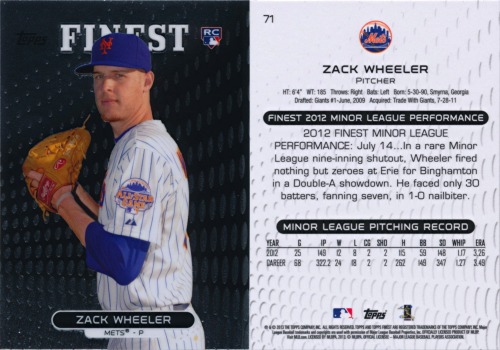
How far Finest has fallen… Scans don’t do base chrome cards justice, but there’s just nothing exciting about this design. The design theme seems to be sheet metal with holes drilled in it. The color from the early years of Finest is long gone, saved for the refractor parallels. No cardback could jazz up this lifeless design, but this one doesn’t even try. On its own merits, this design falls short. Released just two weeks after 2013 Topps Chrome and 2013 Bowman Chrome and less than a month after 2013 Panini Prizm and 2013 Leaf Metal, Finest was caught in a logjam of chrome products. With a small checklist and a high price, a bland design is just inexcusable.
Mets Selection
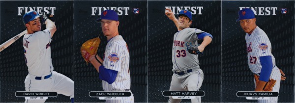
Finest’s 100-card checklist eliminates any need for borderline stars or lesser players. Topps Chrome and Bowman Chrome had to contend with the question of Ike Davis or Lucas Duda, but there was no way either would have a chance here. If nothing else, Finest weeds out all of the filler and focuses on the game’s biggest stars. For the Mets, that means David Wright and Matt Harvey. More than a third of the product is dedicated to rookies, so Zack Wheeler is a given here. Jeurys Familia rounds out the Mets quartet because he’s in everything.
Refractors
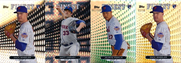
2013 Finest includes the usual refractor parallels: four styles (refractor, x-fractor, atomic, and superfractor) and four colors (green, orange, gold, and red). With eight refractor parallels in total, Finest is one of the most restrained chrome products in the Topps lineup. Eight may seem like a lot, but it is downright reasonable compared to the 13 refractors in 2013 Topps Chrome, 14 refractors in 2013 Bowman Chrome, and even more refractor styles coming in 2013 Bowman Draft. Without a border on the base design, the color is instead applied inside the holes in the background. This diminishes the color’s visual effect a bit, but it’s not like there was much visual appeal to work with in the first place.
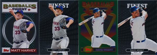
Inserts
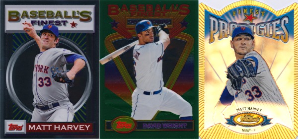
2013 Finest recognized its history with inserts based on the 1993 design. Matt Harvey is featured in the base 1993 style and David Wright is in the All-Star version. Both also have refractor parallels numbered to 25 and 10, respectively. Matt Harvey also has a die-cut Prodigies refractor insert (with a different picture even). Clearly, the Finest brand is capable of delivering a compelling product, just not in modern base cards it would seem.
Autographs
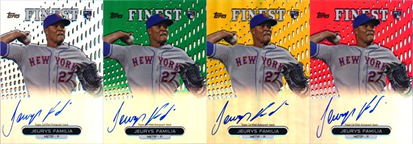
Last year, human autograph factory Kirk Nieuwenhuis was the Mets representative in Finest’s rookie autographs. This year, it was more of the same with Jeurys Familia signing anything put in front of him. Versions include all of the same refractor styles from the base refractors with a slight twist; instead of applying the color to the holes, the entire background except for the holes is colored. With lots of color at the top and the area underneath the signature faded out (as Topps has started doing in most products this year) at the bottom, these look a lot better than the base refractors.
Autographed Relics
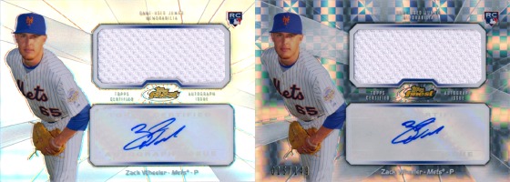
Zack Wheeler is a bit of an upgrade from last year’s Jordany Valdespin in the autographed jumbo relic inserts. These cards feature sticker autographs and jersey swatches sized to match, all in the same refractor variants as the base cards and autographs. The material in these cards is a mix of pieces of Wheeler’s 2012 Futures Game jersey (light blue and white mesh swatches) and pieces of a home white Mets jersey (Wheeler’s first MLB-worn memorabilia) with patch swatches in the low-numbered versions. One downside to the use of stickers is that they force Wheeler to shrink his signature to fit. Wheeler’s unconstrained autographs look great but I’m not sold on the miniature version.
Conclusion
It’s clear that Finest has fallen into a rut after 20 years. Once the industry leader in innovation, it has now been reduced to a simple formula repeated year after year. Topps has added more and more to all of its other chromium products, leaving Finest out of date and out of touch. The small checklist (half of the size of the original 1993 set) and a release date right after two chrome products featuring the same players and better card designs aren’t doing Finest any favors.
The one big selling point of 2013 Finest is its historical connection. The problem here though is that it doesn’t look like the brand has gone anywhere in 20 years. Looking at the 1993 and 2013 designs side by side, there’s not much of a difference. The new design adds team names and player positions but loses color and design concept. This just isn’t a premium product for today’s market. Topps needs to overhaul Finest in 2014 or let it go the way of Stadium Club.
Comments are closed.