Changing up the base Topps formula
 When it comes to base Topps, there hasn’t been much of a difference from year to year in a long time. Most of the elements of the flagship Topps products date back to at least 2012, some all the way back to 2001. It was time for a change.
Card Design
 Pick any Topps design from the past decade plus and (with only one exception since 2004) you’ll find one common element – a white border. That’s gone now, replaced by a patterned color gradient background. The color varies by team, surprisingly including different shades of colors instead of just using the same shade of blue for every blue team. Also gone is the foil name stamp, which, while designed to look fancy and premium, made the names difficult to read. The cards look sharp and fresh, something you couldn’t say about a base Topps design in over a decade.
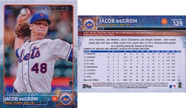
The design is flipped on the back, which is clear and legible. The card numbers are large, a consistent size (something that has been a problem for years), and in a consistent location (2014 Topps Update was literally all over the place). Unfortunately, card number legibility did not carry over to the inserts, but this is a good step forward. Stats now include WAR, apparently fWAR. Come on, Topps, you can fit a little f in there. As usual, the code number at the bottom is so tiny that you can’t read it at 120dpi. This wouldn’t be a problem, except…
SP Variations
2015 Topps Series 1 is full of short prints that are indistinguishable from regular cards except for the code number on the back. For the photo variations, you can at least memorize what all of them look like. But Topps brought back the much-hated sparkle variations, which have a tiny, sometimes partial, sparkle somewhere on the card. These are tough to spot and are exceptionally boring. The only Mets short prints are sparkles of David Wright and Daniel Murphy, which I have no interest in owning. I’m really getting tired of squinting to read tiny codes on every base Topps card I have. Why can’t these be glossy or use thicker card stock or something?
Mets Selection
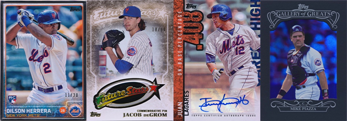
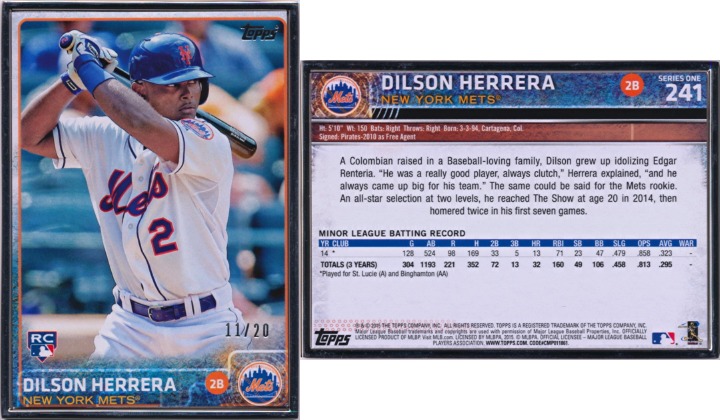
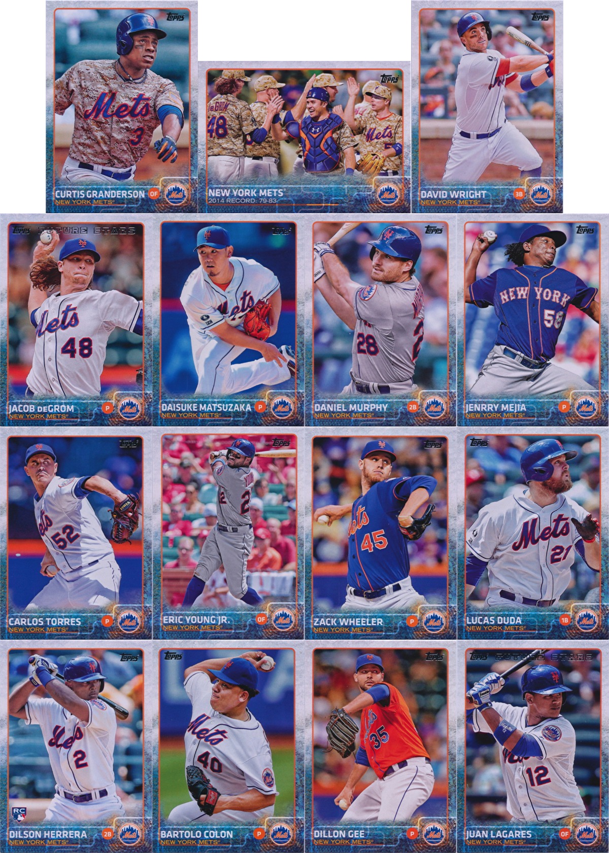 One area that didn’t disappoint is the Mets team set. With 14 players, a team card, and Lucas Duda on the NL Home Run Leaders card, there wasn’t much more you could ask for. This was partly due to the expansion of the set from 330 cards to 350 cards. There are the usual departed players (Daisuke Matsuzaka and Eric Young Jr.), but the rest is a good mix of current Mets. Topps wisely avoided the shortstop position but got just about everything else except for Harvey, Niese, d’Arnaud, Cuddyer, and the various backup roles. This includes the first Mets card of Carlos Torres and the first of many Dilson Herrera Rookie Cards.
One glaring omission though is the classic home pinstripe jersey. The now discontinued snow white jersey is featured on 8 of the 15 cards, but there’s no sign of pinstripes. The road grey, home blue, road blue, camo, and even Los Mets jerseys are all featured over pinstripes. Where are the pinstripes?
Topps Originals
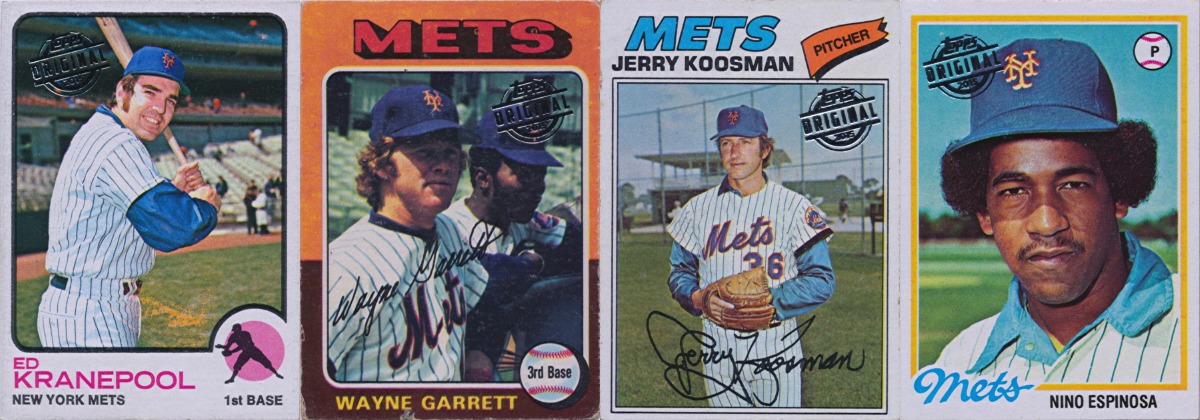 As it turns out, the past is full of them. Every single buyback card I’ve gotten from 2015 Topps Series 1 features a pinstripe jersey. Condition varies, but it’s nice to see some older cards. Whether the foil stamp enhances or degrades the card is still up for debate.
Parallels
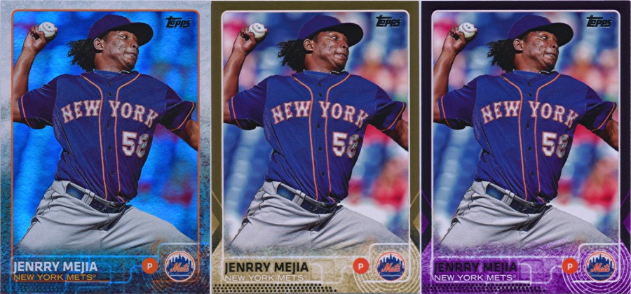 Back to the present, the lack of a white border would seem to make parallels more difficult. And who doesn’t love random color border parallels? Well, it turns out that Topps finally got the message and ditched the red, blue, yellow, and green parallels. The foil parallels have been simplified and the gold parallel (numbered to 2015) has a metallic border. The lone remaining store exclusive parallel, Toys ‘R Us purple, is metallic like the gold. When it comes to common parallels, this is plenty. In fact, some of them are a little too much; continuing with their problems from last year, the printing company Topps uses still can’t cut a proper 2.5″ by 3.5″ card. While the base cards and inserts are all about the same size, the gold and purple parallels are all over the place. Did they cut these by hand? Frankly, it’s embarassing to see a company with such a long history of making cardboard rectangles fail so miserably at the most basic production elements. Just when you think someone actually cares about the finished product, you get something like this…
 On the rarer side, camo (numbered to 99), black (numbered to 66), pink (numbered to 50), clear (numbered to 10), and platinum (numbered to 1) parallels are back. New for 2015 are framed parallels, numbered to 20. Like the framed inserts in 2014 Topps products, these feature versions of each of the 350 base cards inserted into a large metal frame. This is a great addition to base Topps. Just ignore how horribly cut the card inserts are…
Inserts
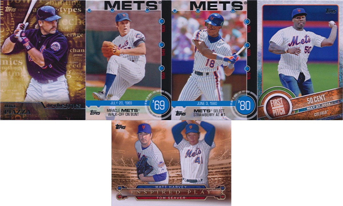 The inserts here are all about past Mets greats. Piazza, Seaver, Strawberry, 50 Cent? Yes, that terrible ceremonial first pitch that just won’t go away has been commemorated in cardboard. This is also Matt Harvey’s only appearance in 2015 Topps Series 1. And check out all those pinstripes…
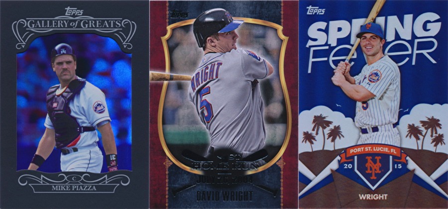 But wait, there’s more. Piazza is featured a second time in the Gallery of Greats insert set on a foil card with a matte black frame layer over top of it. These look amazing in person and are an interesting replacement for the thick premium cards that have been hobby exclusives in the past. On the retail side, David Wright is featured in the First Home Run insert set, which we’ll see more of later. Wright is also in the Spring Fever set, which this time was distributed via exchange cards that were given out in hobby shops on launch day instead of being inside packs or being given out weeks after launch. I guess that works.
Autographs
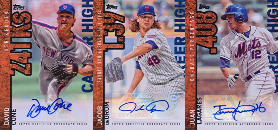 Another area that has seen stagnation in recent years is the base autograph set. Frequently used as a dumping ground for sticker autographs from retired players and failed prospects, this year’s set (named “Career High” for no real reason) featured some interesting names. David Cone hasn’t had many autographs lately, but he seems to have provided Topps with a few new sticker sheets. Some of his older (and more legible) autograph stickers are also mixed in to give you a variant to chase. Jacob deGrom’s autographs keep coming, which makes me worry about the state of his elbow. And Juan Lagares finally makes his autograph debut after two seasons in the majors. This may be the best Mets autograph crop since 2011. Dilson Herrera and Jacob deGrom were also featured in the Spring Fever Autographs set, but those were far more limited.
Memorabilia
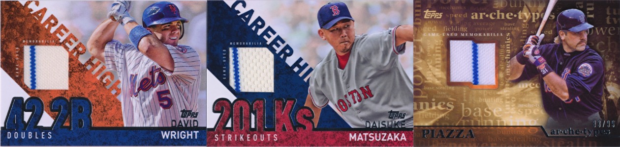 The Career High memorabilia set only included one Met but featured swatches from two Mets uniforms. Daisuke Matsuzaka is shown in a Red Sox uniform, but his material is clearly from a Mets jersey. Just about every insert set has autograph, relic, and autographed relic variants these days, so Mike Piazza also gets in on the pinstripe parade.
Manufactured Material
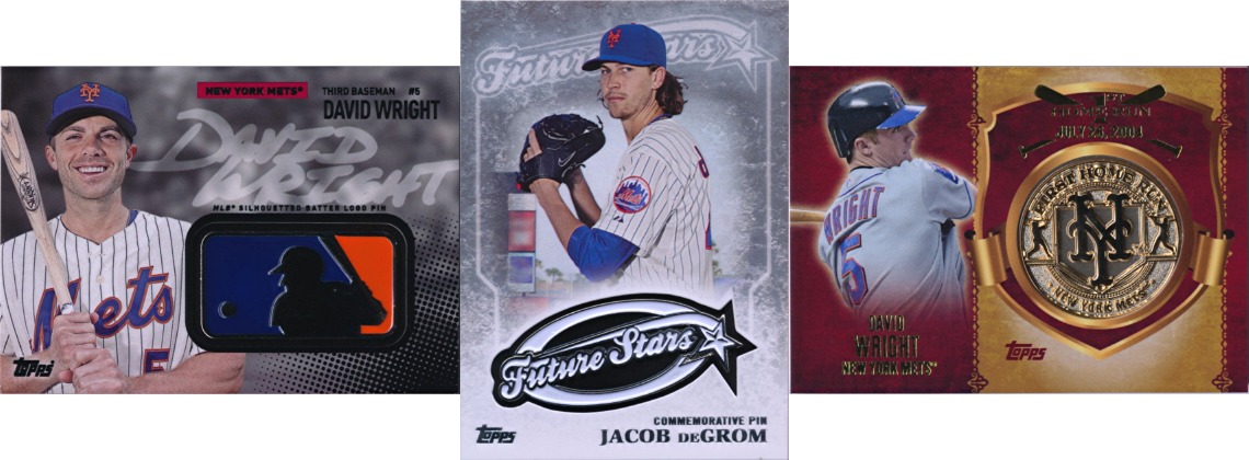 In another departure from tradition, all of the manufactured material in 2015 Topps Series 1 is metal. David Wright has a metal MLB logo pin relic, Jacob deGrom has a metal Future Stars pin relic (small consolation for losing out to Masahiro Tanaka in the Topps Rookie Cup Team), and Wright is featured again in the retail-exclusive First Home Run Medallions. This is a great look for base Topps, but I’m starting to miss the coins…
Oh, right, there are coin (Wright and Piazza) and stamp (Seaver and Strawberry) and coin and stamp (Seaver and Strawberry again) cards in there too. These are essentially the same as the ones we see in Heritage, so I’m not quite sure if they make sense here. But it’s something.
Insert Parallels
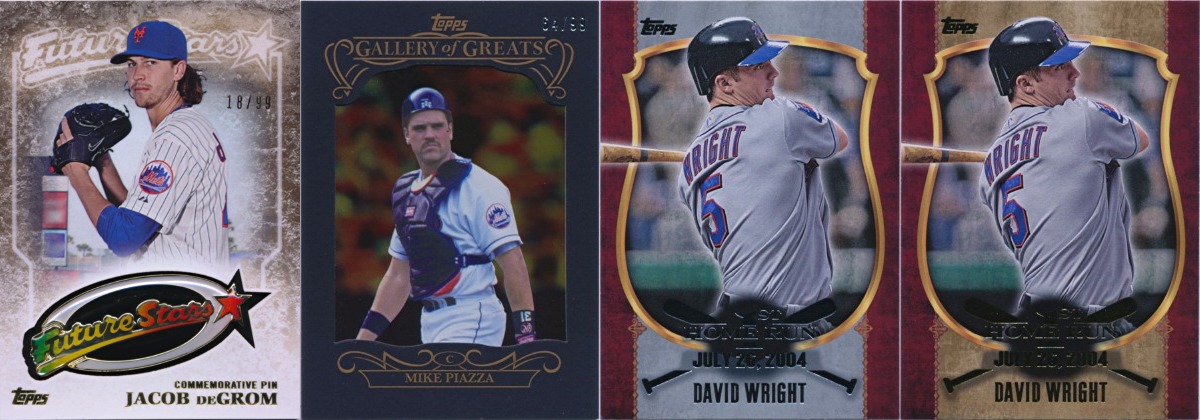 In addition to the autograph/relic/autographed relic variants, a few inserts also had parallels. Jacob deGrom’s Future Stars pin got a rainbow treatment (numbered to 99), Mike Piazza’s Gallery of Greats insert also came in gold (numbered to 99), and David Wright’s First Home Run card could also have a silver or gold background depending on what type of retail product it came out of.
The Verdict
Base Topps is a hobby staple, but it still needs to be refreshed from time to time. Topps got this one mostly right, changing up the look, expanding the set, bringing back team cards, cutting back on parallels, and doubling down on metal. But with continued problems cutting the cards correctly and short prints that induce eyestrain, there’s some definite room for improvement. Still, Mike Piazza is back and Topps is finally embracing Juan Lagares, so there’s reason for optimism. Just a little bit.
Comments are closed.