Bleeding blue and fading it too
It’s been a long, cold (and occasionally warm) winter, but spring training is almost here. For those of you lucky enough to attend, it’s a great time to get autographs from your favorite players. If you can manage to pick up a stray baseball, that would be a great thing to get autographed. But what kind of pen to use? It sure would be helpful if someone had a long-running experiment to see how different types of ink hold up over time in different conditions. You might think you’re in luck if you read ahead, but there’s just one small problem: official MLB baseballs are made with natural leather and the cheap $2 versions I use have synthetic leather covers. Since I don’t feel like spending $64 or more on this test, you’ll just have to settle for results that may not apply to your situation. (Update: So it turns out that you can get natural leather balls for about $3 now. We’ll add them in for the next round.)
Review of Test Configuration
Full details can be found here. Back at the beginning of June in 2013, I took some baseballs and some writing implements and put together a little test to see how the various inks would hold up on synthetic leather. Test Ball #1 was placed on a windowsill with no protection from the sun other than the window and the fact that the window only got direct sunlight in the morning. Test Ball #2 was placed in the same location in an Ultra Pro ball cube, but one that didn’t advertise UV protection. Test Ball #3 was locked away in a dark closet. Two months later, all three balls were photographed to document the initial results.
| 31 July 2013 Results | ||
 |
 |
 |
| Test Ball #1 | Test Ball #2 | Test Ball #3 |
Long-Term Results
Two months wasn’t long enough to see the full effect of sunlight exposure, so I left the experiment going for another five and a half months. It should be noted that as the experiment progressed, the balls were exposed to less direct sunlight each day with a lower angle of incidence. Still, the results aren’t pretty.
| 16 January 2014 Results | ||
 |
 |
 |
| Test Ball #1 | Test Ball #2 | Test Ball #3 |
Let’s break down the results by ball to catalog the damage.
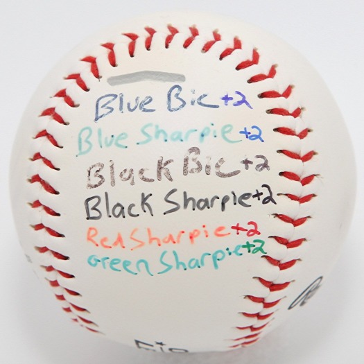
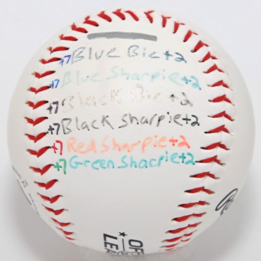
Test Ball #1
| Test Ball #1 Results | |
|
|
| 31 July 2013 | 16 January 2014 |
Poor Test Ball #1. After 7.5 months in the sun, the surface of the ball itself is showing severe damage. The yellowing is uneven, possibly the result of interactions with oil transferred by fingers. Whatever the cause, it was something not seen in either of the other test cases. There’s your ball cube selling point right there. As for the ink, it was a mixed bag. That extra 5.5 months almost completely destroyed the black Bic, blue Sharpie, and red Sharpie. The black Sharpie faded out a little bit more and the blue Bic remained solid but slightly lighter. Most surprising was the green Sharpie, which showed no change over the last 5.5 months, indicating that it might have reached a stable state.
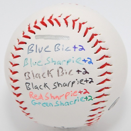
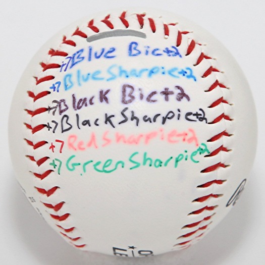
Test Ball #2
| Test Ball #2 Results | |
|
|
| 31 July 2013 | 16 January 2014 |
Other than the lack of yellowing, the results are about the same here. The fading is slightly less severe, but the relative strength of each ink is the same. Black Sharpie was looking pretty good after 2 months, but I’m not as confident in it after 7.5 months. Green Sharpie was a surprise, but the uneven coverage from changes in stroke direction leaves behind dark dots after the initial fading. That leaves the blue Bic as the most durable ink in both sun-exposed cases.
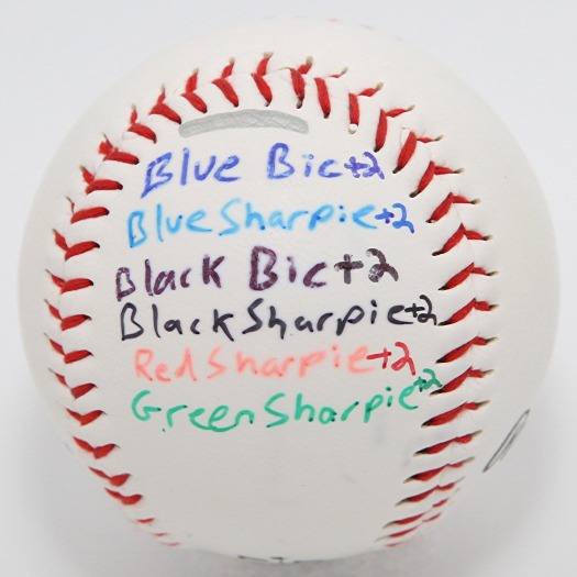
Test Ball #3
| Test Ball #3 Results | |
|
|
| 31 July 2013 | 16 January 2014 |
Meanwhile, the closet held some interesting results. Not much changed for the black and green Sharpies, which both seemed to reach their stable states after 2 months. The red and blue Sharpies on the other hand continued to bleed. The blue and black Bics, which didn’t show any bleeding on the other test balls, bled considerably in darkness. This concerns me.
Bleeding in the Dark
You would think that the ideal storage location for autographed items would be in total darkness. These initial results would seem to contradict that conventional wisdom. Why would bleeding be present in darkness but not in sunlight? One possibility is that the environmental conditions (temperature, humidity, etc.) in the closet played a part. To account for this in the future, the control ball would need to be relocated to the same windowsill as the other balls.
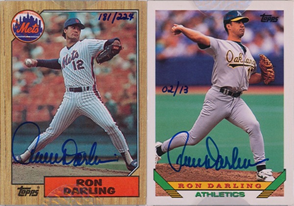
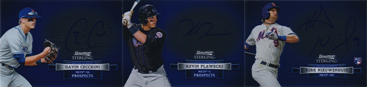
But I don’t think that will change the results any. On July 23, 2013, I got autographs from Gavin Cecchini, L.J. Mazzilli, and Ricky Knapp. Cecchini and Mazzilli received prominent display locations (with no direct sunlight) while Knapp was banished to the shadowy recesses of the next shelf over (without even direct artificial light). Six months later, the Cecchini and Mazzilli autographs still look sharp, but the Knapp has started to bleed. That would seem to indicate that some amount of UV exposure might help the ink to set. How much exposure is required isn’t something I would be able to nail down without a bucket of balls, so unless Rawlings decides to help me out, this will remain a mystery.
Go for the, um, bronze
You might have noticed that I’ve been using metallic markers to identify each test. The first test, now concluded after 7.5 months, was denoted by silver. The next test was going to be gold, but the cap on my gold marker didn’t quite seal right and it dried out. My previous gold marker was lost in a car and never recovered. After all that, Staples finally sells metallic Sharpies individually, but that didn’t help me when I was setting up Test Number 2. So next up is the bronze test.
Blue ball-points FTW
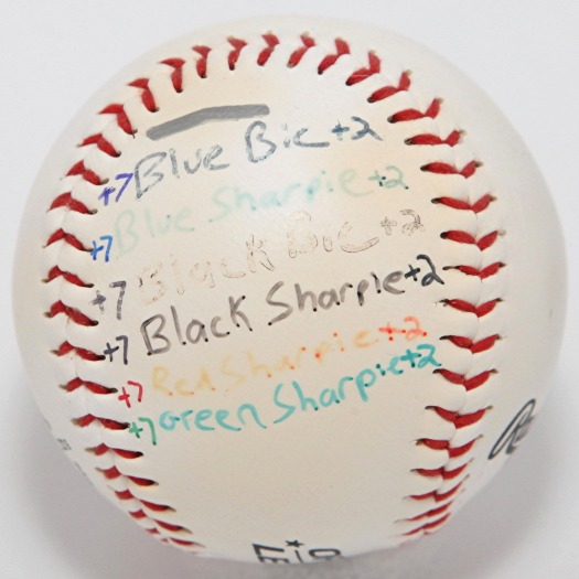
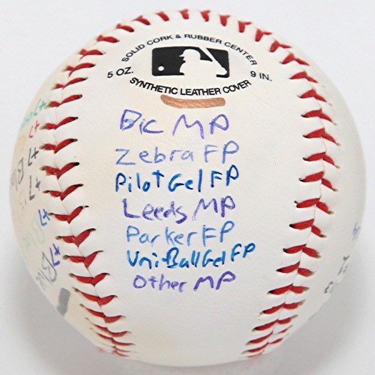
Test Number 1 answered a few questions and raised a few more, but one point we can conclude is that the blue ball-point is the best type of pen to use on a synthetic leather baseball. But which blue ball-point is best? For the second round, I have assembled a vast array of seven different pens in three categories: medium point (MP), fine point (FP), and gel fine point (Gel FP). Two samples of each with name-brand inks were applied to our now four test balls, plus a generic medium point sample from a random pen I had lying around. This should also give us an idea of whether the location of the ink on the ball is a factor, because I haven’t been accounting for that and it could completely invalidate everything if it turns out to be significant.
| Second Test Day 0 | |||
 |
 |
 |
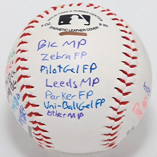 |
| Test Ball #1 | Test Ball #2 | Test Ball #4 | Test Ball #3 |
And here we have our freshly-marked test subjects. Like before, Test Ball #1 gets no protection beyond the window, Test Ball #2 gets an Ultra Pro ball cube (without claims of UV protection), and Test Ball #3 gets total darkness (provided by two nested cardboard boxes). New Test Ball #4 gets a fancier Ultra Pro ball cube that advertises UV protection and has a hologram on the bottom, though the instructions do say to keep it out of direct sunlight. Forget that, we’re roasting these suckers. All four balls have been relocated to a south side window for maximum sun exposure. I even cleaned all of the dog nose marks off the window first. It may be winter, but there’s still a few hours of sunlight each day. And now the 2014 baseball ink test begins.


Recent Comments