In which I praise Topps for getting (some) things right
 The evolution of the Bowman brand has been interesting lately. Since the last major redesign in 2012, Bowman has added ice parallels, wave refractors, and mini shimmer refractors, removed the First Bowman Card designation, added a new 1st Bowman designation, introduced Bowman Black autographs, confused collectors with 2013 Kris Bryant Bowman Chrome autographs in 2014 products, added wrapper redemptions, ended wrapper redemptions, dropped the pretense of a “base set” in Bowman Draft, and much, much more. After three years of incremental improvements, Topps reshuffled the deck in 2015 and brought order to an increasingly chaotic product.
Base Card Design
 Much like the 2015 Topps Series 1 design, the 2015 Bowman design has moved away from a full white border to something that somewhat resembles 2000 UD Black Diamond. All that’s missing is a full die-cut parallel set (if only…). The design elements are interesting and visually appealing, for the most part. The central area has the player photo with the two-color border, position, and appropriate Bowman logo(s) and features a partial screening effect that made me worry at first that I had forgotten to turn on descreening in my scanner settings. One side (the left for base cards and right for prospects) has the traditional white border with the name and team plates attached and overlapping the player photo. The opposite side has a lightened full-bleed continuation of the photo outside the border without the screen effect.
The back is what we’ve come to expect from Bowman. Clean design, basic scouting report, card number in the upper right, serial number (if there is one) in the upper left.
The biggest problem with this design is the foil used for the player name and team logo on the front of the paper base cards. Topps got rid of the foil in 2015 Topps Series 1, but it remains in 2015 Bowman, making the sideways names that much more difficult to read. On the plus side, the new Bowman logos that were introduced last year and looked completely out of place on the 2014 designs look like they clearly belong here. Overall, it’s a nice look and a welcome evolution of the Bowman design.
Mets Selection
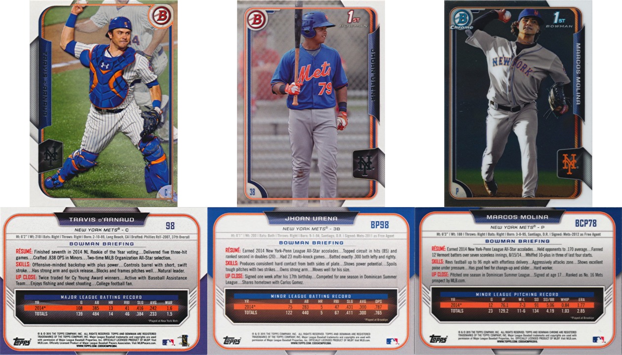
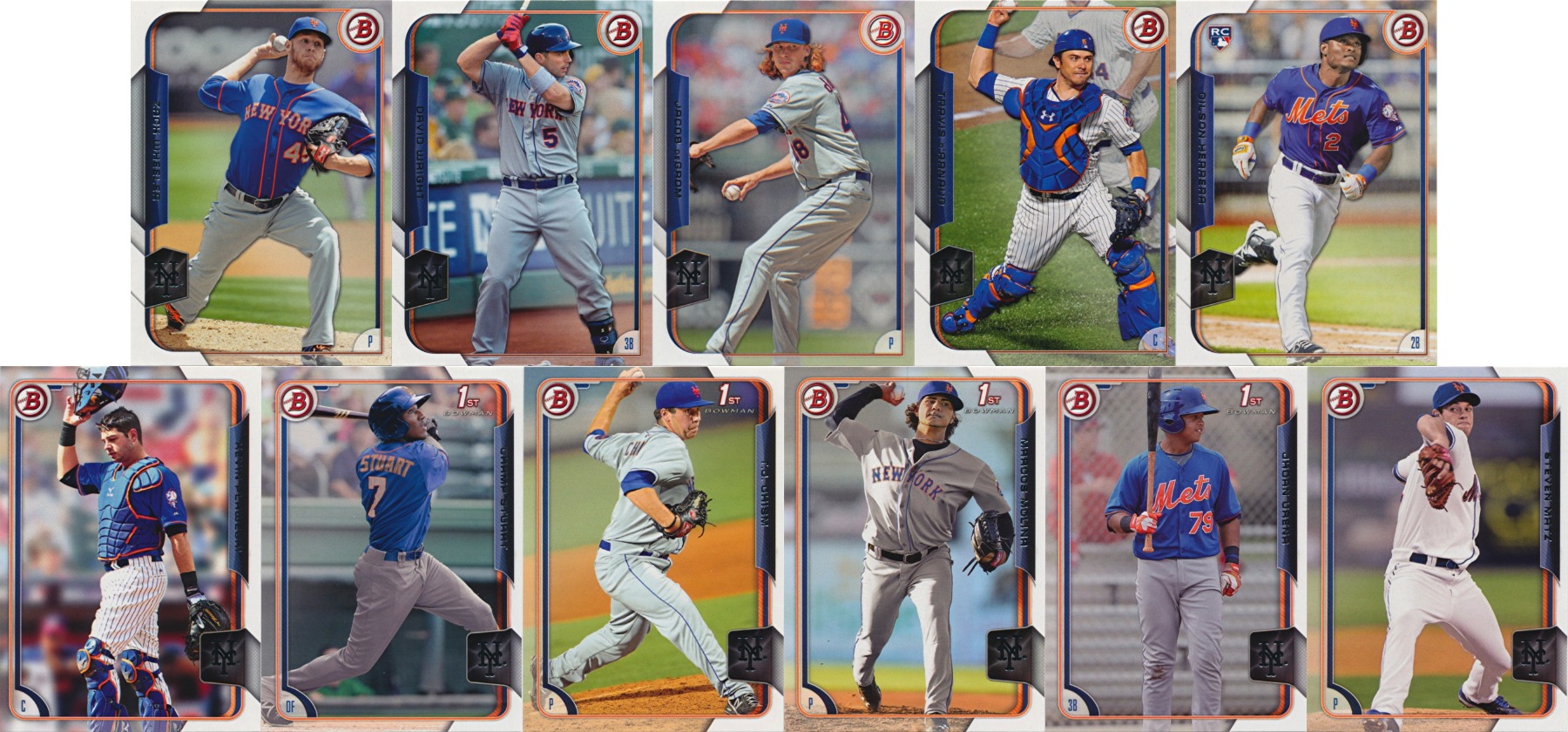 The base set features five Mets, exactly average for a 150-card set. The choices here are mostly the obvious ones: captain David Wright, Rookie of the Year Jacob deGrom, default Rookie Dilson Herrera, and Travis d’Arnaud and Zack Wheeler, who were both poised to have breakout seasons before injuries. It would have been nice to see a few more, but there’s just not enough room in such a small set. The photography however could have been a bit better. Travis d’Arnaud has one of his best photographs to date, a crisp and bright action shot with great color and a pinstripe uniform (the only of its kind between base Topps Series 1 and Bowman in 2015, which is just a shame). The others all have serious problems with shadows, sharpness, or color. Sadly, Topps remains crop-happy, constantly cutting off body parts to make the player take up more of the card. Real baseball players don’t have feet, I guess.
If you were expecting another 12 Mets prospects after last year’s Bowman, you’re going to be a bit disappointed here. Even with the set size increasing from 110 to 150, the Mets content fell by half to just six, slightly above average. Or exactly average if you don’t count T.J. Chism, who signed with the Somerset Patriots in the offseason. In addition to Chism, Champ Stuart and Jhoan Urena have their first cards in 2015 Bowman while Marcos Molina has his first base Bowman card (but not his first Bowman card as the logo indicates; he had an insert in 2014 Bowman Draft). The last two spots went to likely 2015 call-ups Kevin Plawecki and Steven Matz. Despite the downgrade from 2014 Bowman, this is still a decent showing for Mets prospects.
Parallels
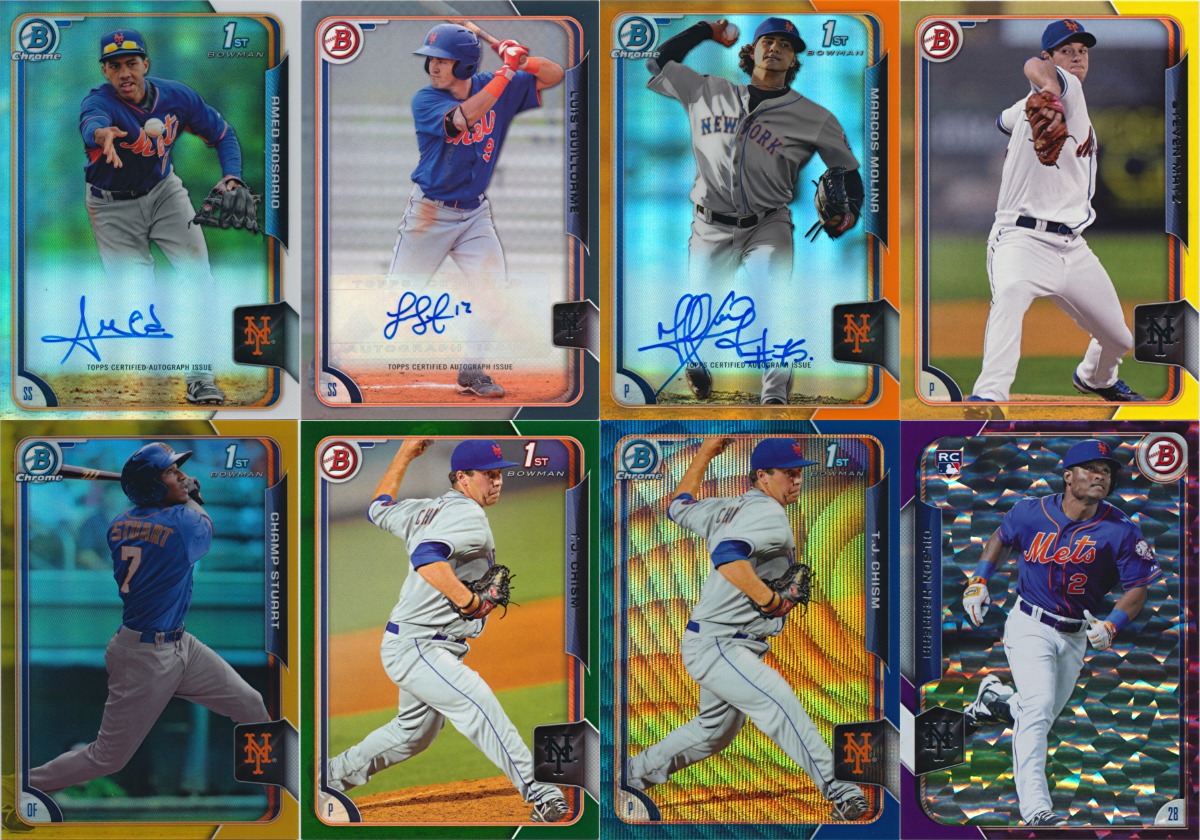 One of the most frustrating aspects of Bowman has been the parallels. The colors and numbering are always vastly different between Bowman and just about everything else, including Bowman Chrome and Bowman Draft. Last year’s Bowman featured four colors of ice parallels, six colors of wave refractors, and nine each of paper parallels and refractors, all with different color options and numbering schemes and some of which had different numbering for base and prospect cards. On top of that, autographs, minis, etc. had their own completely different numbering schemes. Black parallels alone could be numbered to 99, 50, 35, 25, or 15 depending on the type of parallel and type of card. And this is all before they added bubble, shimmer, static, and carbon fiber refractors in Bowman Chrome.
Somebody listened. The state and hometown parallels, a Bowman staple for almost 20 years, are gone. Good riddance, those things (like the pre-2014 gold parallels) were too common to be worth anything but not common enough to build sets out of (and they could be tough to spot). The oddball refractor concepts from 2014 Bowman Chrome are also nowhere to be found. Ice parallels remain at four varieties, wave refractors are down to two (blue and orange, the only ones that matter) plus an asian exclusive black wave. Paper parallels also get a couple of exclusives, yellow retail and black-red Asian exclusives, while refractors have black Asian exclusives. And everything else follows a standard rainbow-based color scheme: Purple (numbered to 250), Blue (numbered to 150), Green (numbered to 99), Gold (numbered to 50), Orange (numbered to 25), and Red (numbered to 5). Silver paper / base refractor (numbered to 499 or unnumbered) and black paper / superfractor (numbered to 1) round out the list. Autographs and minis follow the same numbering guidelines, though not all have every parallel. Finally, a system that makes sense. And now you can collect a “rainbow” that actually looks like a rainbow.
So far, Topps has kept to this numbering scheme wherever it made sense in other products. This is nothing short of amazing. Topps deserves a lot of criticism for how it handles various aspects of its products, but they got this one absolutely right.
Inserts
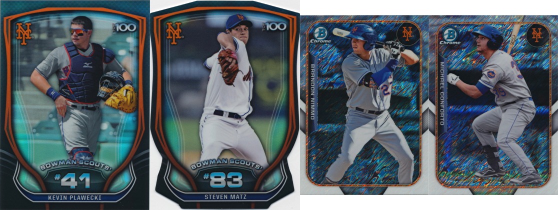 As usual, Bowman is filled with huge prospect insert sets beyond the paper and chrome prospect sets that are technically, but not really, inserts. The 100 Bowman Scouts Top Prospects and the 150 The Farm’s Finest Minis are back, with six Mets in the former (Herrera, Plawecki, Matz, Montero, Conforto, and Syndergaard), and five (Syndergaard, Plawecki, Conforto, Nimmo, and Matz) in the latter. All five 100+ card sets in 2015 Bowman feature at least five Mets. Not bad. This is the only place you’ll find Noah Syndergaard and Michael Conforto, except for…
Autographs
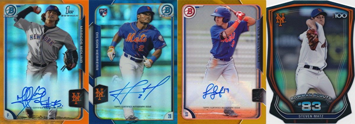
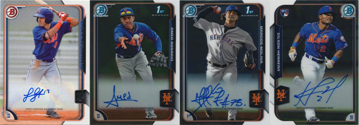 The true measure of a Bowman product is in its autographs. And that’s where the Mets have had mixed success in recent history. 2012 Bowman had one paper retail auto (Jordany Valdespin) and no chrome prospect or RC autos. 2013 Bowman had just one chrome RC auto (Jeurys Familia). 2014 Bowman outdid both of them combined with three chrome prospect autos (Chris Flexen, Casey Meisner, and Cesar Puello) and two chrome RC autos (Travis d’Arnaud and Wilmer Flores). 2015 Bowman can’t top that but does feature a little of everything with one paper retail autograph (Luis Guillorme), two chrome prospect autographs (Amed Rosario and Marcos Molina), and one chrome RC autograph (Dilson Herrera). These are the first autographs for Molina and Guillorme and the first MLB-licensed autographs for Rosario. No complaints here.
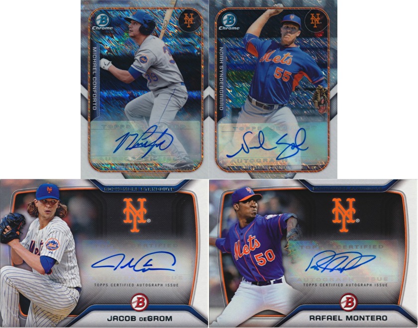 But that’s not all. Bowman usually has a few low-numbered autographs that are too hard to find to be worth covering here. This year, there are no Mets in the Bowman Black Autographs checklist, but there are a few other noteworthy autographs, all on stickers. Jacob deGrom and Rafael Montero are both featured in the Sophomore Standouts Autographs set (base numbered to 99 plus three parallels) and Michael Conforto and Noah Syndergaard have mini autographs (unnumbered base plus four parallels). These are much more attainable than secondary autographs have been in the past and add a few big names to what was already a decent autograph list.
Memorabilia
Kevin Plawecki is alone here with a 2014 Futures Game jersey card numbered to 25. Interestingly, 2015 Panini Diamond Kings, which launched on the same day as 2015 Bowman, also has Plawecki memorabilia from the 2014 Futures Game (though in much larger quantity). Best guess is that the Topps version is, as it has been since 2000, the jersey worn during the Futures Game while the Panini version features Plawecki’s batting practice jersey (which was auctioned off after the event). Noah Syndergaard’s 2014 Futures Game jersey (either one) has yet to appear in cards.
The Verdict
I’m shocked that Topps made significant changes that actually made sense and make their product more collectible. I’ve come to expect so little from them that I would have been less surprised to see 10 different new patterns of refractors and three more shades of yellow parallels (each exclusive to a different retail pack type). Collectors have been calling for a coherent parallel strategy for years now and this is the first time that Topps has done something about it. It remains to be seen just how far Topps will take this, but it’s a step in the right direction.
In terms of content, there’s not much to complain about. The shrinking base set is unfortunate but necessary for a product like this. I would go further and limit it to RCs while expanding the prospect set, especially now that Bowman draft has dropped its unnecessary RC base set. And the autographs this year may be one of the best Mets crops in Bowman history, featuring eight players from last year’s first round draft pick to last year’s Rookie of the Year, all produced in sufficient quantity to give the average collector a chance to own them.
But that photography… Bowman has become known for its terrible photoshopping of minor league photographs, but 2015 Bowman just looks bush league all around. After this and 2014 Stadium Club, it has become apparent that Topps uses a standard formula for card photographs – standard poses, standard (excessive) cropping, no room for variety or originality. When sorting cards, it feels like you’re seeing the same card over and over because half of the cards use the same two or three poses. Topps has managed to suck the life out of the key element of their cards. The effect is subtle and numbing until you hit a vibrant and dynamic card like the d’Arnaud, or even the T.J. Chism.
Topps is doing so much wall art these days that I’m surprised that they don’t have a simple test for their photography – if this were my favorite player, would I want wall art of this card? Most of these are a clear “no,” and not because of the terrible use of foil on dark backgrounds. That d’Arnaud though… I’ve never bought Topps wall art before, but that d’Arnaud would be awfully tempting.
Comments are closed.