It’s a Harvey Day miracle!
Matt Harvey is pitching for the Mets tonight, so it’s fitting that the Matt Harvey 2013 All-Star jersey I ordered last month got here earlier today. As you would expect, the first thing I did with it was scan it to within an inch of its life. Now wrinkled and creased, it will go into my closet until I have an appropriate opportunity to wear it. Being more than 200 miles from Citi Field (and with no more Mets minor league teams heading out this way until next year), that might not be for a while.
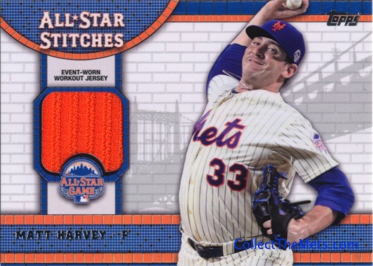
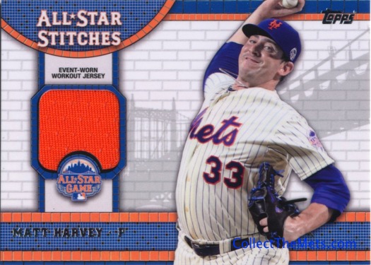
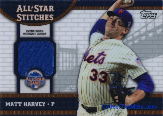
What I can look forward to though is seeing pieces from the Harvey-worn version of this jersey embedded in cardboard in Topps Update this fall. Harvey, David Wright, Carlos Beltran, and Marco Scutaro should all have pieces of their respective jerseys represented in that product, so let’s take a look at what we can expect to see. (The Futures Game jerseys worn by Rafael Montero, Noah Syndergaard, and Brandon Nimmo should also be in this style and can be expected in this fall’s prospect-oriented releases.)
The typical trend with All-Star jerseys is for the style to be whatever will be used for the following year’s batting practice jersey. This year’s BP jersey is in its second season of use and a new style is due up for next year. That means we’re in for something new in this year’s All-Star jersey.
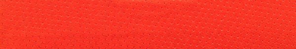
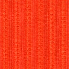
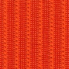
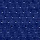
Fabric Panels
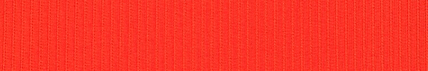
Front panel, outside
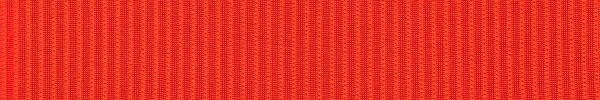
Front panel, inside
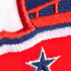
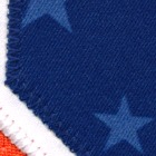
The most notable feature in the current BP jersey, the separate shoulder panel, is gone in the 2014 model. Aesthetically, the differently-colored shoulder panels on most BP jerseys (the Mets were allowed to use an all-blue BP jersey as consolation for not getting their blue alternate jerseys approved for 2012) looks terrible. The new model extends the shoulder panel from sleeve cuff to sleeve cuff with separate panels on each side of the front, all in the same material (and hopefully always in the same material). Speaking of the material, the base material for these jerseys is something we haven’t seen before in a baseball uniform, so I’m not sure what to call it. Lined? Flip it over and it gets really shiny, which should be interesting in cards.
The underarm panels, which have extended the full length of the jersey in the past, extend about 18 inches from the sleeve cuffs and stop about a foot short of the bottom. Strangely, these blue panels are attached to the outside of the orange panels with orange thread, which looks terrible.
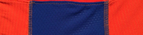
The biggest change is the back panel, which is now in the same pinhole mesh fabric as the underarm panels only in the primary color. This should be a welcome change for people with sweaty backs, particularly catchers whose sweat causes bacne that some mistake for a sign of steroid use. Cuffs extend around the entire sleeve opening and the top of the front panels in a two-tone pattern that resembles the JMCOGy cuff material from the ’80s blue road jerseys.
 |
 |
 |
 |
| ASN-13-JCLO | ASN-13-JCLO2 | ASN-13-JCPO | ASN-13-JCPB |
 |
 |
 |
Patches
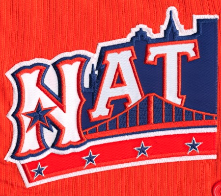
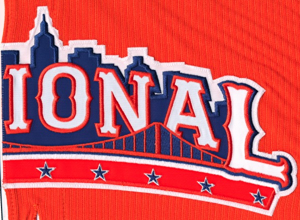
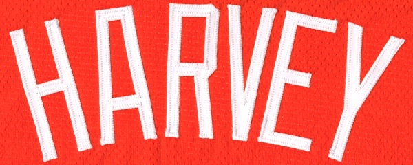
The front “National” patch is split into two pieces, one on each front panel. These patches have an unusually satiny feel to them.
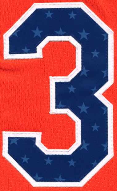
As you can see at the top, the name plate patches are all simple white letters. We’ll probably see them in 1/1 letter patch cards in 2014 Topps Series 1. Numbers are dual-layer with a white bottom payer and a blue patterned upper layer. This year’s design has light blue stars in it. Here’s a 3, you can guess what the full 33 looks like.
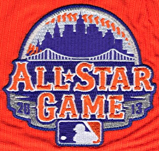
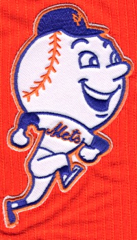
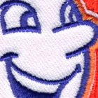
The left sleeve features the 2013 All-Star logo, which is also the standard Mets logo this year. That leaves the right sleeve free, so Mr. Met gets the call to fill space (only applies to Wright and Harvey jerseys, obviously).
 |
 |
 |
 |
| ASN-13-JP-NL | ASN-13-JP-Num | ASN-13-JP-ASG | ASN-13-JP-MM |
Tags and Miscellanea
![]()
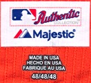
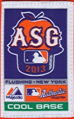
This year’s MLB logo is a rubbery bubbly thing, unlike anything we’ve seen before. On the other side, the Majestic tag and size information is in a thin rubbery film instead of a standard tag. The combination of the new tag and logo mean that there is nothing rubbing against the back of the neck. It makes sense, but I wonder about the durability of the new MLB logo. Finally, the main majestic tag features the apple ASG logo.
Comments are closed.