Category Archives: Product Spotlights - Page 3

Product Spotlight: 2014 Bowman Inception

May contain trace amounts of MLB players

Last year, Topps added a premium thick card product to the Bowman lineup in the form of Bowman Inception. Unlike the other Bowman products, Inception features autographs on thick card stock with a mostly matte finish. For the subject matter, Inception mixes a few token RC autos (to appease the MLBPA) with a mix of top prospects.

Inception’s Initial Offering

Which is how we wound up with this pairing: Jeurys Familia, the default Mets Rookie with autographs in everything, and Travis d’Arnaud, the top prospect received in the R.A. Dickey trade. This was d’Arnaud’s first Mets autograph, but otherwise there isn’t much notable here. The concept may have been new, but the generic ballpark sky background and the focus on established prospects and Rookies took away any sense of excitement. Would things be any different the second time around? Well, sort of.

Read more »

Product Spotlight: 2014 Topps Archives

Send in the clones

Two years ago, Topps brought back the Archives brand for the fourth time (following 1982, 1993-1995, and 2001-2005), once again changing the formulation to fit the modern collecting landscape. 2013 brought a few key changes to Archives, some of which were kept in 2014’s iteration along with a lot of significant additions. In the end though, 2014 saw the smallest autograph checklist ever in Archives and the least variety in card designs, with parallels attempting to make up the difference.

Card Design

Like last year, 2014 Archives uses a more vintage card stock than the 2012 version. The years selected for this go-around are a bit odd. 1973 is a classic design that looks great with today’s printing technology. 1980 is also a solid design, but it was one of the featured designs in 2012 Archives. Too soon? And then there’s 1986… If there’s an ’80s Topps design to skip, that’s the one. 1989, also featured in the die-cut minis in 2014 Topps Series 1 and Series 2, is a reasonable choice considering its 25th anniversary, shared with the movie Major League. Unlike previous years though, the short prints did not feature any additional designs and were instead limited to these four. Even the Fan Favorite Autographs only added the base designs from 2013 Archives. I really don’t get what Topps was thinking with these choices.

Mets Selection

Six Mets made the cut in the 200-card Archives base set. Travis d’Arnaud and Wilmer Flores are the default Mets Rookies in everything this year, Tom Seaver and David Wright are franchise players, and Matt Harvey and Curtis Granderson are somewhere in the mix for additional filler. Sadly, there’s not much star power on this team, so this is about the best that could be expected. One disappointment is that only the 1973 and 1989 designs are featured, but the SPs take care of the rest.  In terms of photography, most of these look like spring training photos, which look great on these designs.  The Wilmer Flores photo adds another to the list of Mets shown in Los Mets jerseys in 2014 Topps products.  The Granderson though looks awful.  And awfully familiar…

Once, twice, three times a photoshop

Really, Topps? You didn’t get even a single picture of Granderson in spring training? By the end of May, there is no excuse to be using lame photoshop jobs for a player signed last year. Series 1 and Heritage get a pass, Gypsy Queen is pushing it, but Bowman and Archives are simply unacceptable.

SPs

One other change to this year’s Archives SPs is the appearance of active players among the 50 SPs. Zack Wheeler is the lone Met in the 1980 design and Mookie Wilson and John Olerud have 1986 covered. With no alternate designs, many retired players appear in designs from outside their playing years, which was previously only seen in base cards. Also like the base cards, the SPs use the same pseudo-vintage card stock as the base set. The only things setting the SPs apart now are the card numbers and insertion ratios.

Parallels

Like last year, all 200 base cards have a gold rainbow foil parallel numbered to 199. I still prefer the gold foil used in the 2012 Archives parallel, but I appear to be in the minority. New for 2014 and following in the silver trend seen in several other Topps products this year is a silver rainbow foil parallel numbered to 99. As in previous years, the SPs do not have parallels, which is a bit disappointing considering that most of the key RCs are SPs in 2014 Archives.

Mini Topps Deckle Inserts

In 2012 and 2013, the Archives Mets team set has been heavy on SPs and light on inserts. 2014 flips that around with only 3 SPs and a whopping 10 inserts. Unfortunately, three of those are of the mini deckle variety. The whole mini thing is so overdone at this point that, short of bringing back a Topps Leaders product, I would prefer to see all of these minis retired permanently. On top of that, the deckle edge die-cut pattern around black and white photographs with blue facsimile signatures creates one of the ugliest looks in all of sports cards. And yet it keeps coming back. I’m glad to see more John Olerud Mets cards, but I could do without this one.

1987 All-Star Inserts

This one is even more loaded, with Dwight Gooden, Gary Carter, Howard Johnson, and Matt Harvey featured here. These use the familiar design of the All-Star Commemorative Set cards inserted in rack packs from the ’80s. Unlike those cards though, these do not use glossy card stock and instead use the same standard card stock as most of the rest of the inserts. With so much of an emphasis on recreating vintage styles, the lack of high gloss here is a big miss and keeps this great design from really popping.

Other Inserts

But that’s not all. After getting Seaver in the 1972 basketball design last year, 2014 Archives brings us Seaver in the 1971 hockey design. Is football up next in 2015? Sadly, no Mets were featured in the most interesting insert set, the die-cut wood Firebrand insert set. 2014 Archives also featured two retail-exclusive insert sets, 1987 Future Stars and 1988 All-Stars (named “Retail Chase” for some reason). Howard Johnson and David Wright represent the Mets in those sets, respectively.

Fan Favorites Autographs

As always, the real draw among the common inserts is the Fan Favorites Autographs set. 2014 Archives features the smallest base autograph set of any Archives product with just 38 players signing this year. Five of those, John Olerud, Lenny Dykstra, Mookie Wilson, Howard Johnson, and Lenny Harris, are shown as Mets. Unlike the two previous Archives products, active players were also featured in this checklist, though none of them were Mets. Also unlike the previous Fan Favorites Autographs set, this year’s set features a few duplicate players from the 2012 and 2013 sets; Johnson and Wilson were also featured in 2013’s set and Olerud appeared in 2012’s set as a Blue Jay. Oddly, the lightened signature area that was introduced in 2013 was removed this time around, making the signatures harder to see (particularly on blue areas like Olerud’s jersey). The biggest change though would bring back something only previously seen in 2005.

Parallel Autographs

Parallels! The only time Archives autographs have had parallels before was back in 2005, and those were rainbow foil (similar to this year’s silver parallels) parallels numbered to 10. 2014 Archives went in a different direction with multiple tiers of colored border parallels: gold (retail exclusive, numbered to 50), silver (numbered to 25), purple (numbered to 10), sapphire (numbered to 5), and printing plates (four each numbered 1/1). Like we saw last year though, that doesn’t work for the 1990 design, so instead we got tinted background variants for those, which ranged from somewhat noticeable to nearly indistinguishable. The 1986 design fared somewhat better, but that’s really lipstick-on-a-pig territory:

And so it goes. The other designs looked decent, but purple? Silver I get because of this year’s silver fetish, but purple is an odd choice. First 2014 Bowman introduces purple base parallels numbered to 10 alongside the usual purple ice parallels numbered to 10 (not to be confused with the unnumbered retail exclusive purple prospect parallels), now this. It’s an odd time for Topps to start being consistent with its parallel numbering.

Other Mets

Several notable former Mets appeared in the 2014 Fan Favorites Autographs set with other teams. Carlos Baerga and Orlando Hernandez had their first certified autographs since the ’90s and Don Zimmer had his final autograph card to be issued before his death. Rickey Henderson also had a limited number of cards issued as redemptions.

The Rest

In addition to the Fan Favorites parallels, 2014 Archives featured several other low-numbered Mets autographs. David Wright and Mookie Wilson were in the 1981 mini autographs set, combining an awful design with the hated mini format. Gary Carter and Howard Johnson had 1987 All-Star autographs while Wright was featured again in a Retail Chase autograph variant. Darryl Strawberry, who was featured as a Yankee in the 1967 Winners Celebrate box toppers, was featured as a Met in the autograph variant. And that rounds out the Mets in this year’s Archives.

The Verdict

From a retail standpoint, the reduced production run (about half of last year’s Archives, or about 800 hobby cases plus retail) and the hot-selling Major League autographs made 2014 Archives a successful product. From a collector standpoint though, the value was limited unless you were lucky enough to hit a big card. That’s the norm these days, so it isn’t a surprise. Some of the base autographs held decent value, but the parallels, rather than adding value, devalued many of the base autographs. All five of the base Mets autographs were readily available for under $10 and even some of the printing plate autographs could be had for less than $20. No matter how you look at it, adding more of the same can’t take the place of variety.

The Mets team set has a different composition this year but still comes in at about the same size as always. Fewer SPs, more inserts, fewer autographs, more parallels, and no relics. The first Lenny Harris certified autographs and the first John Olerud Mets autographs since 1999 were definite highlights, but Topps missed the mark on several fronts. Between the odd design choices (and lack of design variety), the lack of gloss on the 1987 All-Star inserts, the underwhelming overload of parallel autographs, the return of mini deckles, and the awful relic design (with no Mets at least), there’s a lot of room for improvement. And that’s not even getting into the absurdly tiny (4 cards!) Major League insert set and the last-minute cancellation of The Warriors cards. Two years after bringing back a classic, Topps is spinning its wheels more than realizing the potential of the Archives brand.

Product Spotlight: 2014 Topps Gypsy Queen

Some good, some bad, and some ugly photographs

Gypsy Queen just isn’t my kind of product.  I’ve never been a fan of tobacco style products, though I can understand the appeal considering the popularity of that era among hardcore collectors.  At least you can get proper toploaders and binder pages for the tobacco size minis, unlike most of the other minis that are plaguing the industry.  And yet, even though I have no interest in building a set of these, I always find myself with at least the Mets autographs and relics plus a base team set.  There’s just something about the distinct simplicity that makes Gypsy Queen stand out.

Card Design

The formula for a Queen Design is pretty simple.  Take some earth tones, add some fancy frame squiggles, and slap a big Gypsy Queen logo on it.  This year’s version is similar to the 2012 design, which is a bit of an improvement over last year’s overly busy look.  I’m not a fan of the heavy use of filters to give the photographs a vintage painting look.  It’s not as bad as whatever went wrong with this year’s Turkey Red, but it looks less “vintage artwork” than “Hey look at this cool Photoshop filter I found!” to me.

Mets Selection

Overall, 8 cards is a bit below average for a 350-card set, but the split between base and short prints is even more off.  Only five Mets made the 300-card base set: Rookies Wilmer Flores and Travis d’Arnaud, Daniel Murphy, and newcomers Curtis Granderson and Bartolo Colon.  Three Mets are among the 50 short prints: Matt Harvey, Zack Wheeler, and David Wright.  While it is strange to see all of the stars missing from the base set and loaded into the short prints, it’s another absence that is most notable – retired players.  Gypsy Queen is loaded with retired stars, more than 50 in total, but none of them are Mets.  This is the first year without Tom Seaver in the base set, though you could just make your own by cutting out a 2014 Gypsy Queen frame and slapping the Seaver picture they use every year into it.  If you were hoping for a full set of identical-photo Seaver Gypsy Queen cards, that’s the only way you’ll get it.

Parallels

100 of the 300 full-sized base cards have blue (numbered to 499) and white (retail exclusive) framed parallels.  Flores, d’Arnaud, and Granderson made the list here.  These are always some of the nicest cards in Gypsy Queen and they’re common enough to be easy to obtain.  On the mini side, all 350 mini cards have a full range of parallels including black (numbered to 199), red (numbered to 99), and sepia (numbered to 50).  Despite the low numbering, many of these carry little or no premium.

Inserts

Two inserts is actually pretty good for Gypsy Queen.  Seaver shows up here, though I’m not liking the sepia treatment of the overly filtered photos.  These would probably look more vintage without the filtering.  At least it’s not the usual Gypsy Queen Seaver photo.

Variants

Matt Harvey and David Wright have all of the photo variants this time around.  The full-sized cards get reverse negative variants (with different photos from the base cards to begin with…) and the minis get the usual photo variants that end up being far more common than the regular versions.

Relics

2014 continues the decline of Mets base relics in Gypsy Queen.  After having four in 2012 and three in 2013, we’re left with just two this year, one full-size and one mini.  And neither features a photograph that comes close to matching the material.  Wheeler’s shows him in home pinstripes, but the material is from last year’s orange Los Mets jersey.  Gee’s material is from his home white jersey, but the photo shows him in, um, black?  Gee hasn’t worn a black jersey in a game since 2011, making the photo more than two years old.  Apparently getting material from last year is easier than getting photos from the last two years…  The Gee also has patch variants numbered to 10 and 5.  Matt Harvey is the lone Met in the jumbo patch relics (numbered to 50 or less), though most of these do not feature patches as the name implies.

Autographs

On the other hand, this year’s Gypsy Queen doubles the total number of Mets Gypsy Queen autographs that have been made.  The first three years of Gypsy Queen gave us autographs from Angel Pagan, Jon Niese, R.A. Dickey, Jeurys Familia, and Kirk Nieuwenhuis.  2014 Gypsy Queen features the first certified autograph card from Jeremy Hefner, RC autographs from Travis d’Arnaud and Wilmer Flores, and autographs from David Wright and Zack Wheeler.  Interestingly, the RC logo is on the d’Arnaud and Flores autographs after being absent on rookie autographs in previous years, proving that nobody has any clue what a Rookie Card is these days.  Parallels include red (numbered to 49), gold (numbered to 25), green (numbered to 10), and purple (numbered to 1).  Wright and Wheeler also have mini autographs (numbered to 10) and autographed relics (numbered to 25).

Verdict

Mixed bag.  On the one hand, the autograph checklist would be good for just about any product and there are a reasonable number of easily obtainable parallels and variants to chase.  On the other, the lack of retired players in the base checklist (even just another Seaver with the infinitely-recycled photo) and relics that are little more than filler (the orange Wheeler jersey has gotten a lot of use so far this year…) leave considerable room for improvement.  ‘Unbalanced’ might be the best word to use to describe this year’s Gypsy Queen from a Mets perspective.

Product Spotlight: 2014 Donruss

A little too much like an old classic

When 2014 Donruss was announced, it looked like it could be the missing piece in the Panini lineup.  After all, while Panini has had some success in high end (2012 National Treasures), shiny stuff (2012/2013 Prizm), prospects (various Elite Extra Edition releases and 2013 Prizm Perennial Draft Picks), and specialty retro (2013 Pinnacle and Hometown Heroes), they have no real base product to speak of.  With an ever-rotating list of products (National Treasures was demoted to an insert set in 2013 America’s Pastime), there’s nothing to really define Panini as a brand.  If you were collecting in the ’80s, you probably associate the Panini name with stickers and not cardboard.  It was only fitting then that Panini should launch their first true base product under the Donruss name, a throwback to a simpler time when it was possible to produce licensed baseball card products in competition with Topps.

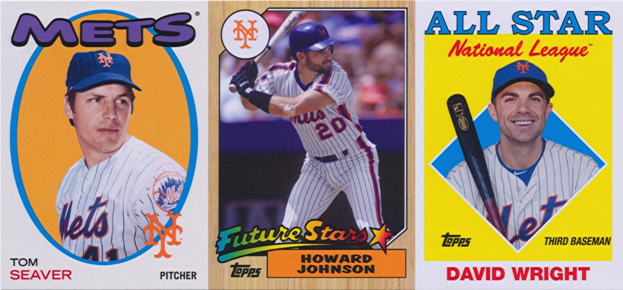
For me, the Donruss name brings back memories of the 1986 and 1989 designs, Diamond Kings, Rated Rookies, and puzzles that never quite fit together right.  There are a lot of classic elements in the history of Donruss but also plenty of bad decisions and disappointments.  Unfortunately, 2014 Donruss takes a few of the former and mixes in a lot of the latter, creating a product that is a little too faithful to the brand’s lineage.

Card Design

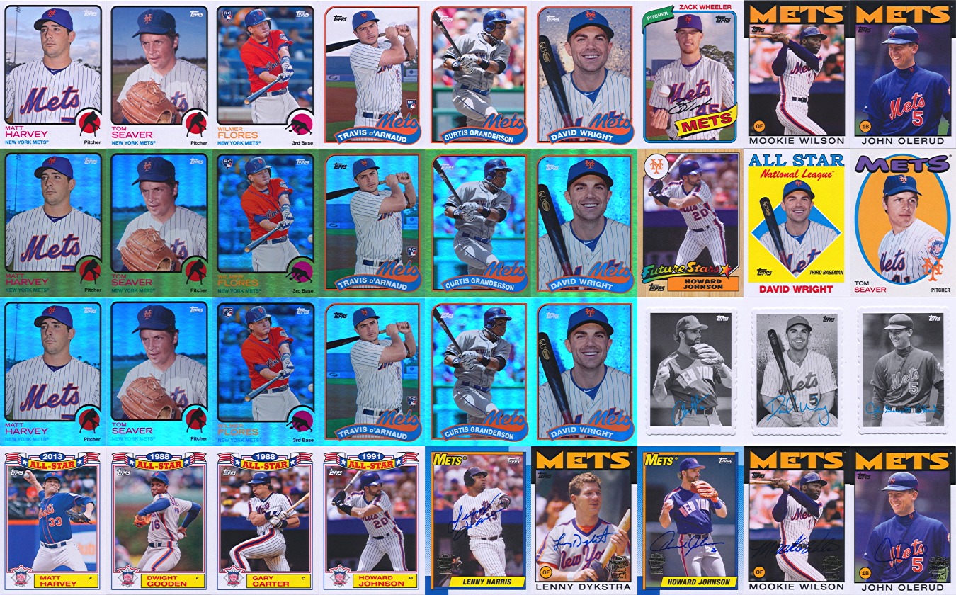
Panini dressed up their first attempt at a base Donruss product like a bride.  There’s something old (the pre-1986 Donruss logo), something new (quality cardstock and gloss coating), something borrowed (the baseballs in the strips of color on either side of the photo), and something blue (the blue cardback style used in 1988 and 1991 Series 1).  Overall, it’s not a bad look, a more refined take on the brand’s design that incorporates elements from across the first decade of Donruss.

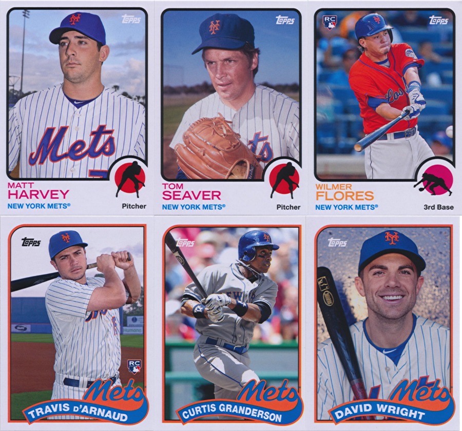
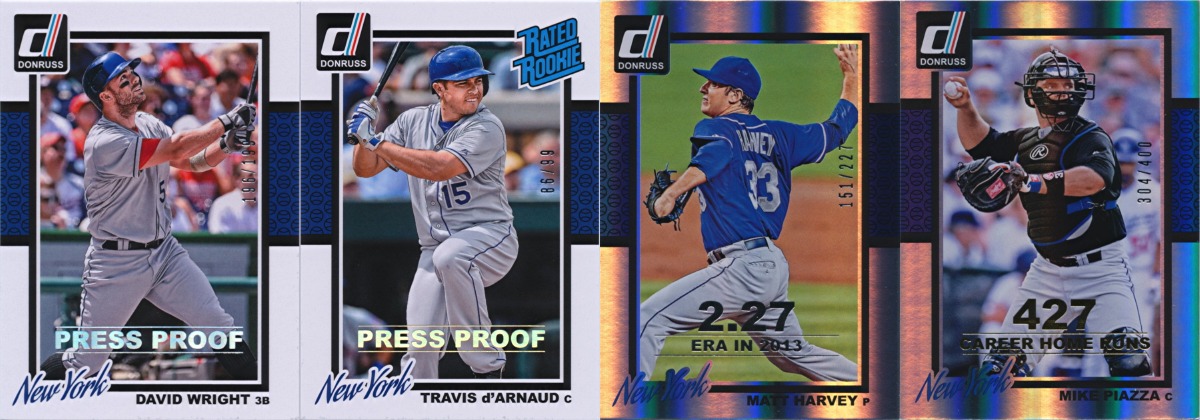
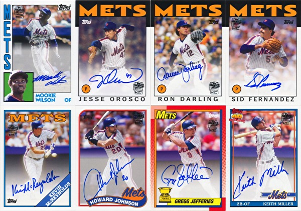
At least, that’s how it looks until you consider the photographs.  The basic design itself is a bit boring, but that makes sense when you consider that the player photograph is what should draw your attention.  You can forgive a border that is devoid of any bright color if it contrasts well with a colorful photo.  And that’s where the lack of a license from MLB Properties kicks in.  Without the rights to use team names or logos, Panini removed all trace of team identity from the photos they used, right down to eliminating the color orange from nearly every Mets card.  The Rated Rookies cards of Travis d’Arnaud and Wilmer Flores use photos from the Las Vegas 51s and the Granderson is obviously a Yankees photo, but everything else looks like it started out as a proper Mets uniform.  The end result is a lot of blue and white, just like the border.  They would have been better off converting the photos to black and white.

Mets Selection

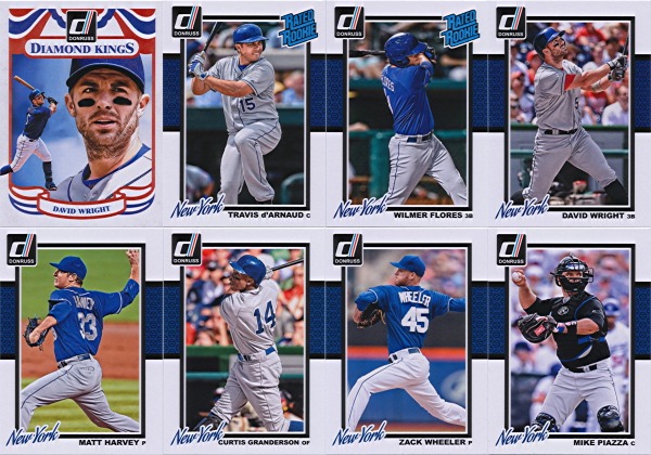
You can’t really fault Panini for their choices here.  Two rookies, two hot young pitchers, one captain, the biggest offseason acquisition, and a future Hall of Famer.  That’s a good core group right there.  And with only 200 cards in the set (30 of which are Diamond Kings with duplicate players), there’s no room for anything more.  Only 200 cards?  That’s the same size as Topps Archives (not counting SPs; Archives is actually a much larger set when you account for SPs), a product that also mixes current players with retired stars.  Shouldn’t this be more in line with base Topps or even Topps Heritage?  200 cards just isn’t enough for this type of product.  Two 330-card series would make more sense, especially if Series 2 could be released in late September with All-Star SPs taking the place of the Diamond Kings.  Panini did use the insert sets to expand the total number of players (Dillon Gee, Jon Niese, Johan Santana, Ike Davis, Andrew Brown, and supposedly Jeurys Familia all appear in the inserts).

Subsets

With only 200 cards to work with, there wasn’t much room for variety in the subsets.  Panini went with the classics here, starting the set with 30 Diamond Kings and 15 Rated Rookies, each subset inserted at a rate of one every 6 packs.  I’m not sure the different level of scarcity between the two subsets makes much sense (each Rated Rookie should fall just over 4 per case on average, compared to just over 2 per case for Diamond Kings), but I guess Panini wanted to pack in the rookies.  In terms of design though, these just fall flat.  The Rated Rookies have all of the same problems as the base cards while the Diamond Kings are just too bland, though the 1984 Diamond King design is faithfully recreated.  Instead of art cards, the Diamond Kings in 2014 Donruss have a pair of photoshopped photographs mimicking the typical Diamond King layout.  The large sections of solid color in the border plus photographs with all detail wiped away equals a design that is simply lacking.

Retro Inserts

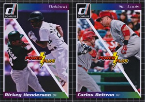
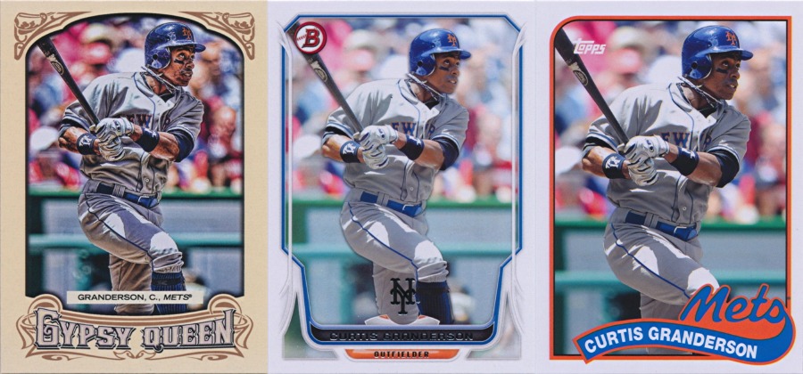
The strongest category by far is the array of inserts found in 2014 Donruss.  We’ll start though with the ones that don’t factor into the Mets team set.  Team MVPs and Power Plus both borrow from the 1989 design and do a good job of remaining distinct despite the common inspiration.  Something about the Team MVPs just looks wrong to me though, probably how the MVP logo is at the bottom over the photo instead of at the top under the photo.  With hat/helmet logos cropped out, the old design just wouldn’t work.  One other criticism is that, like the Diamond Kings subset, the Team MVPs insert set doesn’t have a card from every team.  The set is the right size (30 cards), but some teams are featured multiple times with a mix of active and retired players.

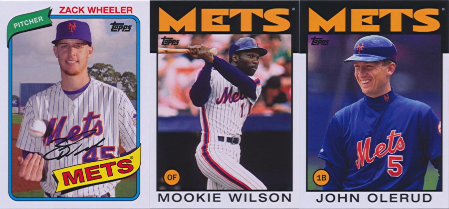
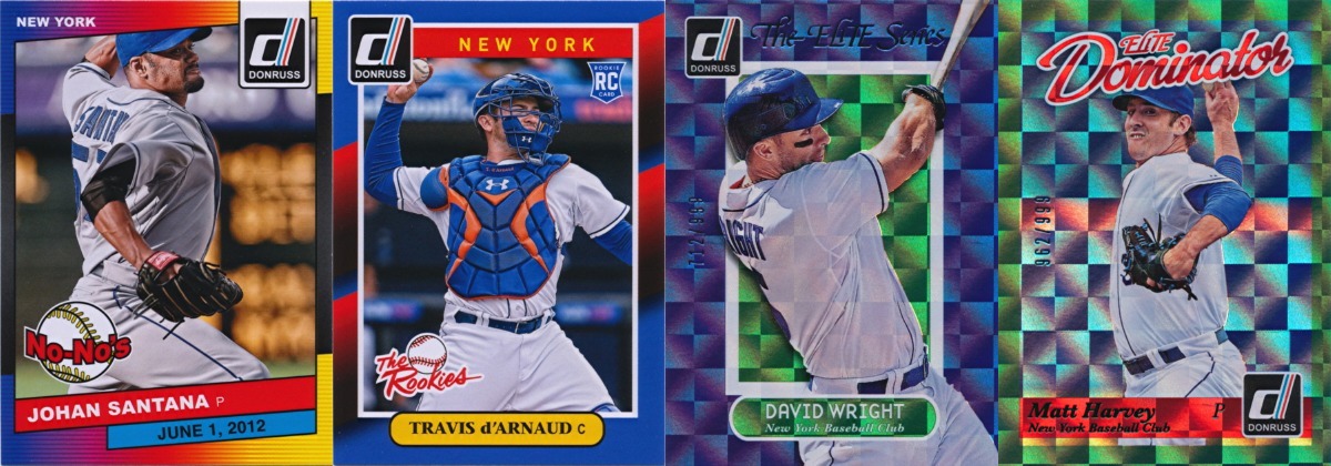
The Mets do have representation in four of the retro-inspired insert sets and the results are impressive.  The best design by far in 2014 Donruss is the one used for the No-No’s [sic] inserts.  The combination of elements from the 1986, 1989, and 1991 Donruss designs is almost seamless and the logo, while new, looks like it could be from that period.  I’m actually a bit disappointed that this wasn’t the base design, I would have liked to have gotten a few more cards like this Santana (instead, only 10 cards were produced in this design).  You barely notice the horribly mangled photograph.

The formula was a bit simpler for The Rookies with the 1988 colors in a new design with a Diamond Kings nameplate and the Panini RC logo.  On top of that, Travis d’Arnaud’s photo is the only one with prominent orange (David Wright’s base card with a visible orange undershirt is the only other card showing a Met wearing orange).

And then we have The Elite Series and Elite Dominators, some nice metallic inserts based on the early ’90s inserts and numbered to match (a more reasonable 999 instead of the original 10,000).  It’s strange to see these falling 2 or 3 per box when the original versions were so hard to pull.  Print runs sure have changed…  Two different Elite insert sets is a bit much though, with the 50 total cards outnumbering the entire Elite print run from 1991-1994.  Another reason why a second series would have made sense.

Modern Inserts

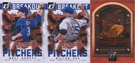
Not all of the inserts in 2014 Donruss look like they came from earlier decades.  The Breakout Hitters/Pitchers and Hall Worthy inserts both feature a mix of matte and gloss textures on unique designs.  This style has previously appeared in Panini Cooperstown and connects the vintage Donruss elements with the current incarnation under Panini.

Parallels

And what modern baseball card product would be complete without serial numbered parallels?  2014 Donruss has four, though they only have two different designs.  The Press Proof parallels come in silver (numbered to 199) and gold (numbered to 99) varieties and feature the standard base card design with a “PRESS PROOF” stamp and a foil-stamped serial number.  The Stat Line parallels are printed on metallic foil and come in season (silver stamp) and career (gold stamp) varieties, though the numbering is based only on the stat shown (with a maximum print run of 400).  It would have been nice if Panini had limited the minimum print run as well; Stat Line print runs can be as low as three.  Some additional variety would also have been nice; a die-cut version or some different color foils would have really helped to set the different parallels apart.

Box Toppers

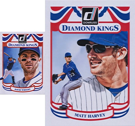
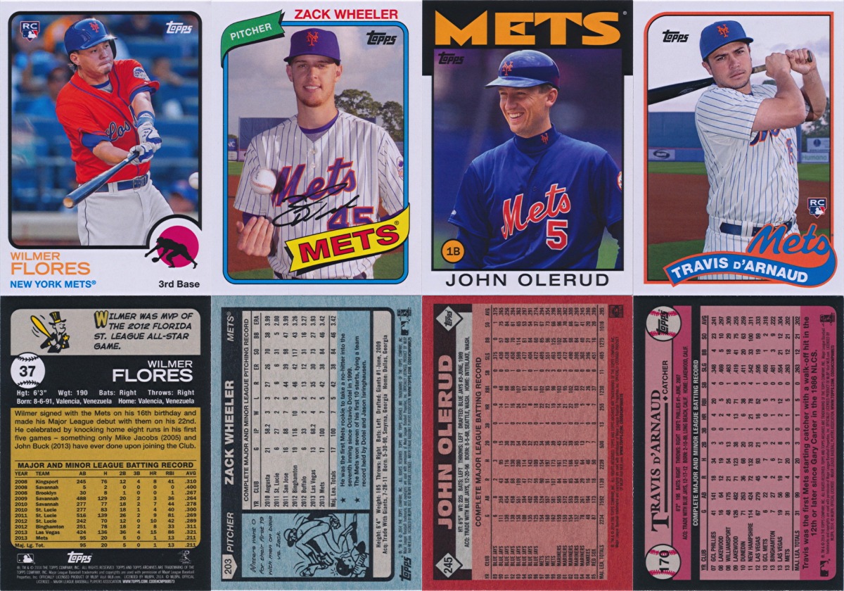
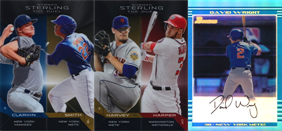
David Wright base Diamond King shown as reference for scale

I don’t know why more products don’t throw a box topper card in every box.  Back in the day, boxes used to have cards printed on the bottom as a small bonus for buying so much at one time.  Box bonuses eventually shifted to the inside of the box with improved quality and decreased frequency.  Today, box toppers tend to be extremely limited with box prices starting at $60 for most products.  Every box of 2014 Donruss includes one of 25 jumbo 5″ x 7″ Diamond King cards as a box topper, with autographed versions of 24 of them randomly inserted at an unspecified rate (while not serial numbered, these are most likely limited to 50 copies or fewer).  Some of the box topper Diamond Kings don’t appear in the base set and vice versa, which seems a bit odd.  Otherwise, this was a great touch and a welcome callback to the jumbo Diamond Kings from decades past.
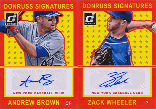
Donruss Signatures

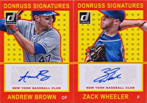
Donruss was one of the first products to feature autograph cards (Upper Deck beat them by just a few months) and the Donruss/Leaf Signature products in the late ’90s are still some of the best autograph products ever produced.  A strong autograph set was therefore a must for 2014 Donruss.  Sadly, the Donruss Signatures name is the only element that draws from the Donruss legacy.  The card design looks like a reject from 2013 Panini America’s Pastime and the checklist is mostly prospects and young players, the type who sign autograph stickers by the thousand (all of the big names are on low-numbered autograph inserts that fall one every two cases on average).  Four Mets are featured in the 50-card set, but Andrew Brown’s first certified autograph is the only one you are likely to find.  Zack Wheeler’s autograph appears to be a short print and no copies of the Jeurys Familia or Wilmer Flores autographs have surfaced so far.

Recollection Autographs

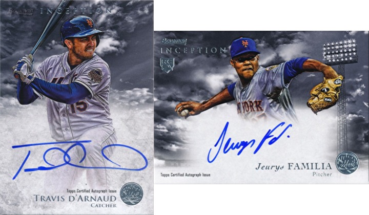
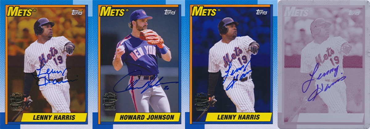
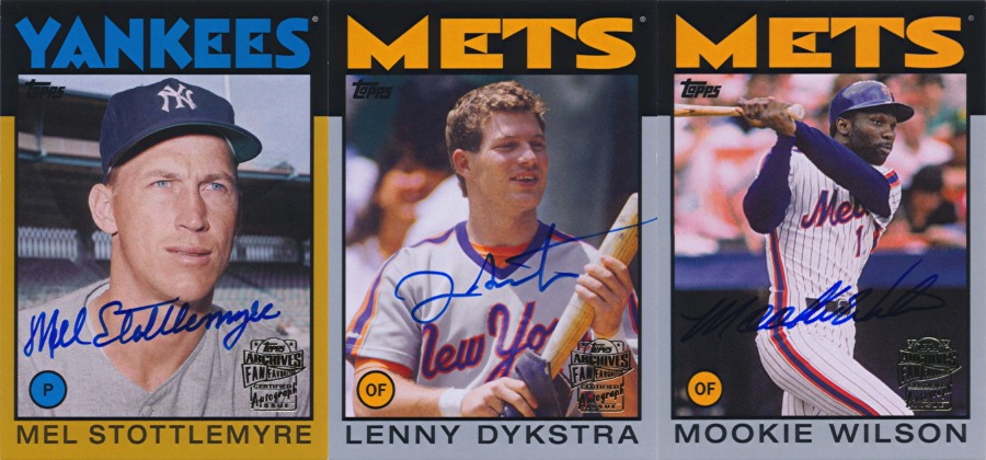
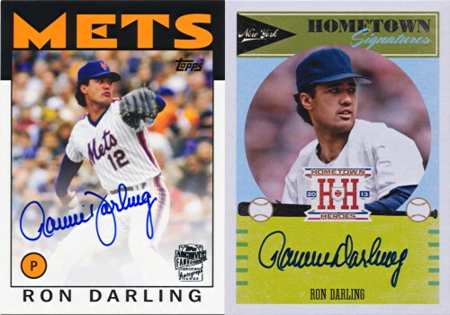
The original Recollection Collection autographs, which ran from 2002 to 2005 in various Donruss and Leaf products, set the standard for buyback autographs.  Featuring diverse checklists of hundreds of players who had appeared on a Donruss or Leaf card of some sort from 1981 to the early 2000s, these cards featured a foil logo stamp, embossed authenticity guarantee, and foil-stamped serial number on the back.  In recent years though, Leaf, now under separate ownership, has had the buyback autograph market to themselves.  2014 Donruss brings back the Recollection name with buyback autographs focused on rookie cards and featuring an embossed logo and handwritten serial number.  Ron Darling, Dwight Gooden, and Darryl Strawberry are the Mets featured here.  A total of just over 1,000 Recollection Autograph cards were produced, making them fall less than one per case on average.  It’s a shame Panini couldn’t have gotten a few hundred more so they could make this a guaranteed case hit.

Game Gear

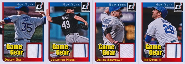
Four Mets are also on the 50-card Game Gear checklist, but this time all four are fairly common.  As 14,000 Phillies pointed out, the Game Gear design borrows from the 1980 What If design from 2002 Donruss Originals.  The Game Gear name itself is a remnant from Pacific, which last produced baseball cards just before Donruss returned under Playoff in 2001.  The material provided an additional throwback; most of the jersey swatches in the Ike Davis, Dillon Gee, and Jon Niese cards are from their 1993 throwback jerseys.  Like the Game Gear inserts in 2001 Private Stock, cards with jersey swatches also have a patch parallel (numbered to 25 in this case).

Wrapper Redemption

It has nothing to do with the Mets, but Donruss announced a wrapper redemption good for a three-card pack of Rated Rookies that will be cards 201-203 in the set.  While the names have not been announced, the Yankees’ Masahiro Tanaka is believed to be among the three.  The wrappers just might be the most valuable thing inside boxes of 2014 Donruss.

Case Break

So far, 2014 Donruss looks like a mild success.  The designs are, for the most part, strong with a good mix of elements from across three decades of Donruss products.  The minuscule set and some truly awful photographs take it down a notch and the lack of a license from MLB Properties hurts its collectibility.  The biggest problem though is figuring out just what kind of product 2014 Donruss is trying to be.  It doesn’t have the checklist to be a base product, it’s not heavy on prospects, the cards aren’t all that premium, and the price isn’t comparable to a discount product.  The guarantee of two autographs and one relic (though two per box is common) per box brings it to a price point comparable to base Topps or a product like Heritage or Archives, but the quality and value of these “hits” is not on par with those Topps releases.  So just what does that make 2014 Donruss?

A disappointment, especially if you open it by the case.  Doing some math puts the print run of 2014 Donruss at around 1,400 cases, give or take.  Spread across those 1,400 cases are 765 premium autographs (plus autographed box toppers), 1018 Recollection autographs, and 1089 patch cards.  The Stat Line parallels add about another 6,000 cards numbered to less than 99.  That gives you a best case scenario of getting one good autograph, a patch card, and four parallels numbered to around 50 in a 16-box case with no other serial numbered autograph or memorabilia cards.  For a $1,000 case, that’s not a whole lot of value.  With perfect collation, the rest of the case should give you two full 200-card sets, 14 155-card base sets, 4 Power Plus insert sets, 2 The Rookies insert sets, 2 Hall Worthy insert sets, 1 No-No insert set, most of the Breakout Hitters and Breakout Pitchers insert sets, half of the Team MVPs insert set, more than half each of the Elite Series, Elite Dominators, Donruss Signatures, and box topper sets, and less than half of the Game Gear insert set, plus plenty of parallels and extra Rated Rookies.

But you’re not going to get perfect collation, even inside a sealed case where collation shouldn’t be a problem.  I took a chance on a team break of a case of 2014 Donruss (done by Brent Williams) knowing that it wasn’t spectacular but expecting a minimum of duplicates of the more limited inserts.  With four Mets each on the autograph and memorabilia checklists, at least there would be a few interesting cards to look forward to.  What I wasn’t expecting was for the collation to be another aspect of the older Donruss sets that was faithfully reproduced in 2014 Donruss.

The Donruss products of the late ’80s and early ’90s were produced in tremendous quantities, but building a set was no easy matter.  This was due to collation so spectacularly bad that you could pull dozens of one card before finding just one of another.  Getting the same card twice in the same pack was not all that unusual.  This problem was hardly unique to Donruss, but Donruss was a prime example of collation that could be infuriating at times.

These days, smaller print runs and more controlled packouts help to keep collation more reasonable, especially within a single sealed quantity like a box or a case.  After all, duplicates in small amounts of a product are largely worthless to most collectors and reduce the value in the product.  With ever-narrowing profit margins, any cheap way to increase value is worthwhile.  So what happened with 2014 Donruss?

The results of this case break were not pretty.  Of the 32 autographs, only 23 were different (one appeared three times).  The Game Gear inserts weren’t much better: 16 different out of 21 base versions.  11 of the 16 box toppers were different with one triplicate among them.  Results for other limited inserts were similar.  By the time the break was halfway through, duplicates had already appeared in all of the major insert sets with checklists 50% or more greater than the number of cards that would be found in a case.

For the Mets, the results were mixed.  The Hall Worthy and The Rookies inserts delivered two each as expected.  The number of Breakout Pitchers inserts was two, as expected, but both were Dillon Gee.  No Elite Series or Elite Dominators inserts turned up, but only two of the 50 are Mets and only 35 (30 different) were in the case.  Only one of the four Mets Game Gear cards were in the case, as were two copies of the Andrew Brown autograph.  One of the two box toppers was a Met, which is reasonable for the checklist size (2 Mets out of 25 cards, 11 different of the 16 in the case).  No-No’s (What’s with that apostrophe, Panini?) massively overdelivered, 6 actual vs. 1.6 expected.  Diamond Kings also came out ahead (3 actual vs. 2.2 expected) while the expectation of 4.3 of each Rated Rookie was accurate for Wilmer Flores (5 in the case) and way off for Travis d’Arnaud (only 1 with bad surface damage in the entire case).  Base cards fell 13 to 15 of each, a bit under the 16+ that would be expected with good collation (each box should have more than 155 base cards, so this indicates bad box-level collation).  Three parallels rounded out the team lot, though none of them had print runs lower than 200.  Overall, it was a slight disappointment with some very significant over and under deliveries that should be extremely rare outliers in a properly managed packout.  Unfortunately, there is no indication of any care taken to manage this product’s packout.

And as for the big hits in the case, the only cards numbered to less than 99 were three Stat Line parallels and an Edwin Encarnacion patch card, with no autographs beyond the base Donruss Signatures cards.  That’s poor even for this product’s checklist, which isn’t that great to begin with.  On the plus side, this means that there will be some cases with multiple limited autographs.  There will also be some cases with no cards worth more than about $10.  For a $1,000 case, that’s just not acceptable.

The Verdict

File this one under “Missed Opportunity.”  The concept was a great one and parts of the execution were outstanding.  On the other hand, other parts ranged from puzzling to awful.  Why wasn’t there a Diamond King and Team MVP for every team (not to mention only 10 No-No’s [sic])?  Why were all of the photographs photoshopped to oblivion?  Where are the Jeurys Familia and Wilmer Flores autographs?  Who thought a 155-card base set made any sort of sense?  And how did the collation go so horribly wrong?  Panini clearly put a lot of effort into bringing together three decades of an iconic brand into one product, why did they stop short of taking the steps necessary to make it a success?

I just can’t recommend buying large quantities of this product to anyone.  A few packs or even a box may make sense for some fun nostalgia, but a case has nothing to satisfy anyone.  Set collectors will be out of luck unless they buy several cases.  Hit collectors won’t see any sort of return.  Team collectors won’t have much to chase with this tiny checklist.  And anyone who appreciates good photography will want to stay far away from this one.  2014 Donruss missed the mark and in the process delivered the modern equivalent of its 1991 predecessor.  This was not the product collectors wanted or the product collectors needed, just a mindless diversion until something better comes along.

Product Spotlight: 2013 Bowman Sterling

Getting it right the second time around

To appreciate 2013 Bowman Sterling, you need to look back at 2012 Bowman Sterling.  Which I didn’t write a review for.  That means you’ll have to get through a quick 2012 review before we get to the good stuff.  Sorry.

2012 Bowman Sterling – Underachieving to the Max

If you can’t see the autographs, try tilting your screen

It was hard to get too excited about 2012 Bowman Sterling.  Now without any memorabilia cards, this was an autograph-only release with a token base set.  You would expect some high-quality autographs from a set like this.  And there they are in that image above.  Really.  Look closely.  Trust me, just look in those big dark spots.  See those slightly darker areas?  Those are autographs.  Yeah, these are some awful cards.  Terrible design, terrible colors, and players nobody really cared about by December of 2012.  Rookie Kirk Nieuwenhuis was the default Mets Rookie Card autograph in 2012, so he only had a few dozen more interesting autographs on the market at the time.  Gavin Cecchini and Kevin Plawecki had their first autographs the month before in 2012 Bowman Draft Picks & Prospects, but those were really the only ones anyone needed.  Unless there are some sweet refractor autos in here.

Taste the rainbow. Or maybe just something yellow.

Nope, just these.  The most common refractor varieties are shown above: base refractors numbered to 199, gold refractors numbered to 50, and black refractors numbered to 25.  So much color and variety.  Bonus points if you can tell the difference between base and black refractors without looking at the serial numbers.  With autographs like this, the Matt Harvey base Rookie Card may be the most interesting card in 2012 Bowman Sterling; Harvey’s only other Topps Rookie Cards are in 2012 Topps Update.

2013 Bowman Sterling – Second Attempt

And that brings us to 2013.  On the surface, nothing had changed from 2012.  Sterling was once again a premium autograph-only release with a token base set, essentially a chromium version of Bowman Inception with a bigger autograph checklist (plus the aforementioned base set).  One look at the cards though will tell you that this is nothing like 2012 Bowman Sterling.

Autographs

This time around, the autograph cards in Sterling are a more visually pleasing portrait orientation with large design elements and a signature background that makes the ink more visible.  It’s not going to compete with Bowman Chrome for the most desirable autograph card style, but it stands well enough on its own.  On top of that, the player selection is greatly improved from 2012.  The two Mets with autographs in Bowman Draft, Dominic Smith and Andrew Church, are here as expected, plus late-season replacement Rookie Card signer Zack Wheeler (on stickers unfortunately).  That alone is a modest upgrade over 2012, but then we add the first autographs from L.J. Mazzilli (son of Mets favorite Lee Mazzilli) and the first Mets autographs from Noah Syndergaard (the other big chip in the R.A. Dickey trade along with Travis d’Arnaud, who had his first Mets autographs in 2013 Bowman Inception).  Sterling has something unique to offer instead of being filled with leftovers.

And that’s not even considering the refractor autographs.  Black refractors are out, replaced with blue refractors at the 25 level.  Gold stayed the same, only at the fifth level down instead of the second.  Base refractor numbering went down from 199 to 150 and three new levels were added: green at 125, ruby at 99, and orange at 75.  The ruby coloring wasn’t quite as distinctive as it could have been, but this was a huge improvement over 2012.

Base Cards

And we haven’t even gotten to the base cards yet.  Inserted at a rate of just one per pack (compared to three per pack for autographs), these aren’t easy to get.  The three top names from the autograph list show up here: Wheeler, Syndergaard, and Smith.

As for the refractors, the base cards don’t get the three new refractor levels and go straight from base refractors (numbered to 199) to gold refractors (numbered to 50).  The lack of common variations and poor scanning results make these the weakest cards in Sterling.

Inserts

We’re not done yet.  Next up are a pair of The Duel inserts featuring Dominic Smith and Matt Harvey.  Topping it off is a sapphire reprint of David Wright’s Bowman rookie card.  Wright joins Jose Reyes as only the second Mets player in this set, which ran throughout all of the Bowman products in 2013.  All that’s left are the autograph inserts, most of which are on stickers and all of which are numbered to 50 or less.

The Verdict

As one of the final products of the year, Bowman Sterling is an easy one to overlook.  2012 Bowman Sterling faded into the background, but 2013 Bowman Sterling proved that Topps still had something new to offer after more than two dozen products.  Let’s hope that attitude carries over into 2014.

Head to Head: Fan Favorites Autographs vs. Hometown Signatures

Topps and Panini showcase minor stars in major ways

It’s common for different companies to attempt to produce the same product with varying levels of success.  When it happens with baseball cards, we’ll put them Head to Head to find out which one comes out on top and what room there is for improvement.

Last year, Topps revived its Archives brand as a celebration of past card designs and fan favorite players you may have forgotten.  This year, Panini countered with Hometown Heroes.  The alliterative title alone made it clear that Panini was aiming squarely at the target market for Archives (which itself was known as All-Time Fan Favorites in a past incarnation).  The Hometown Signatures insert set is a clear counterpart to Archives’ Fan Favorites Autographs insert set, a collection of on-card autographs from dozens of the game’s lesser stars.  Ideally, I would compare the complete offerings of both products, but the Hometown Heroes base set is so unappealing that I haven’t gone anywhere near it.  Even the secondary autograph insert sets are fairly boring (and all use sticker autographs, though Archives has gone in that direction as well), so there really isn’t anything worth looking at except for the Hometown Signatures set.  And even that may be a bit of a stretch.

Card Design

Luckily, we have plenty of overlap in the Fan Favorites Autographs and Hometown Signatures checklists.  Ron Darling is the lone Met common to both sets, so let’s start there.  On the Fan Favorites Autographs side, Topps uses classic card designs with new photos and a faded section at the bottom for the signature.  Hometown Signatures on the other hand combines geometric shapes in light blue and light green to make, well, that.  A chartreuse section at the bottom serves as the signature location.  Since Panini lacks a license from MLB Properties, no team names or logos are used, just a “New York” team identifier.  Only the 2013 Hometown Heroes logo adds any distinctiveness to the overwhelming blandness of the design.  Both feature the newer form of Darling’s signature, which you can get in person on a card of your choice at the Queens Baseball Convention, January 18, 2014 at McFadden’s Citi Field (subtle plug).

This isn’t a showdown so much as it’s a one-sided smackdown.  Panini starts out at a disadvantage without team names and logos, but a generic design with the worst possible color combination isn’t helping.  On top of that, the blue ink on green background turns the signature blue-black, keeping the main focus of the card from standing out.  I haven’t even gotten into how the use of vintage cardboard stock with an unspectacular modern design (I would say “vintage-inspired” if I could figure out the inspiration) makes everything look like a cheap knock-off…  The 1986 Topps design isn’t exactly a crowd pleaser, but the execution on modern card stock is flawless.  Combine that with the nostalgia of 1986 and you have a clear winner to go along with Panini’s clear loser.

Player Selection

Well, that wasn’t very exciting.  Maybe a look at the checklists can even things out.  The 2013 Hometown Signatures set weighs in at 93 cards, far more than the 58 cards in the 2013 Fan Favorites Autographs set.  While many of the names on the Hometown Signatures list are familiar from the 2012 and 2013 Fan Favorites Autographs sets, there are a few notable exceptions.  Among those are the first Pat Tabler autographs I’ve seen and the first Garry Templeton autographs since 2001.  In all, 14 former Mets are included, including four as Mets (well, “New York” at least): Darling plus Lenny Dykstra, Darryl Strawberry, and Lee Mazzilli.

Yes, Lee Mazzilli has his first autograph from a company other than Upper Deck and his first autograph card with a player photograph since 2007 in the Hometown Signatures set.  It may not be pretty, but it’s something.  So what does the Fan Favorites Autographs set have to offer?

Looks like Fan Favorites Autographs takes this one too.  Mookie Wilson, Jesse Orosco, Ron Darling, Sid Fernandez, Kevin McReynolds, Howard Johnson, Gregg Jefferies, and Keith Miller are all shown as Mets.  Miller’s card is his first autograph card and his first card of any kind since 1995.  Another seven former Mets are shown with other teams, including Ray Knight, Bret Saberhagen, Hubie Brooks, and four others in common with Hometown Signatures.  The Fan Favorites Autographs set just has more to offer.

Verdict

There’s nothing more to say, Fan Favorites Autographs wins this one easily.  When going up against an autograph set with history dating back to 2001 and a formula that has been refined nearly to perfection, you need to bring your A game.  Panini used a childish design to appeal to childhood memories and it just didn’t work.